50-41 | 40-31 | 30-21 | 10-1 (Nov. 13)
Welcome to theScore's NHL logo countdown. This list examines logos that date back to the inception of the Original Six, and it includes the main emblem for all 32 current teams, 11 clubs that moved or went through a name change, and seven logos that have undergone a significant redesign. Only primary ones were considered.
The five-part series concludes with the top 10 on Friday. Let's continue with Nos. 20-11.
20. Phoenix Coyotes
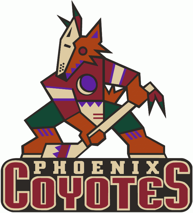
Opinions on this logo are often split. Some think it's too busy, while others love the creativity. The Kachina design is unique, and it ties the team nicely to the Arizona area. However, the emblem seems to be more popular now after making its return on the Coyotes' throwback jerseys than during the late '90s and early 2000s, when it was the club's primary logo. Don't be surprised if it becomes the primary again in due time.
19. Calgary Flames
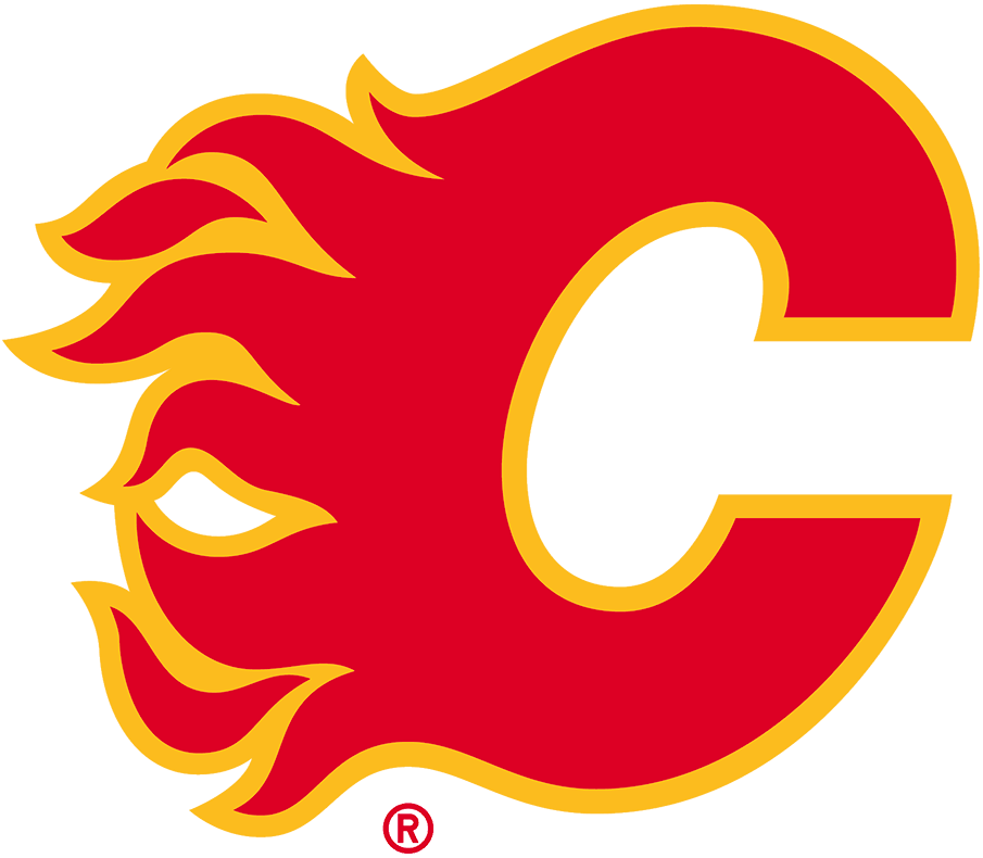
What else could you really ask for other than a flaming "C" in Calgary? The club has stuck with this base design through slightly different iterations since its inception, and the recent simplification of the logo - removing a black outline - makes it look flawless on one of the sport's best uniform sets.
18. Vancouver Canucks (1978-1992)
The Canucks' flying-skate logo is the franchise's best. It's a bold, intricate, and cleanly executed concept that still holds up as one of the league's top emblems. The clash of black, yellow, and orange is unique and works well with the design, as opposed to the first time the club applied the flashy color scheme.
17. New York Rangers
The Rangers' shield-style logo is among the best of its kind. The team needed a few tries before settling on this font and design, and it's been in use since the '70s. The logo is simple with bold colors, but complex doesn't always mean good.
16. Pittsburgh Penguins
A golden triangle to represent the downtown Pittsburgh area and a fierce-looking Penguin on skates is an iconic look for the franchise that's donned this crest for all five of its championships. Classic, simple, and effective.
15. Edmonton Oilers
We love a unique wordmark, and the Oilers' droopy font has stood the test of time. Edmonton has never shifted from the base design of this logo - save for one ultra-bold alternate jersey - and we don't see a reason why the club ever would.
14. Winnipeg Jets (1979-90)
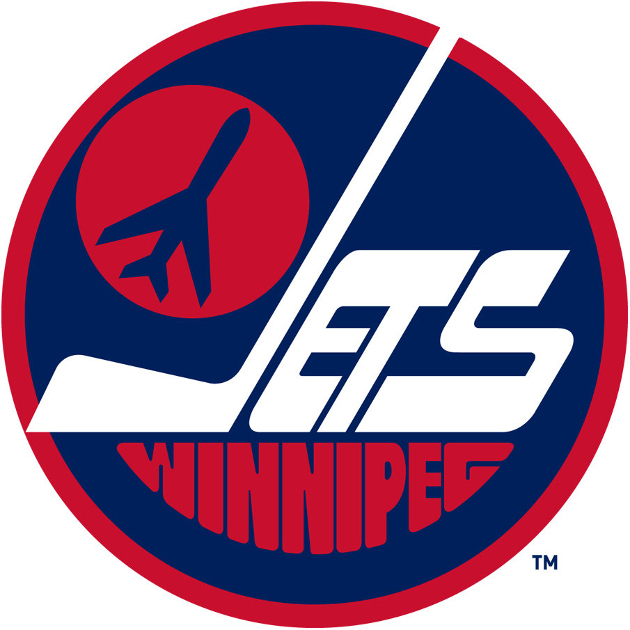
Many were calling for the Jets to bring back this sublime design when the team returned to Winnipeg, and rightfully so. The colors are bold, the letters pop out, and it's a delight for the eyes. The "J" being in the shape of a hockey stick is also a nice touch on one of the most timeless logos in NHL history.
13. Colorado Avalanche
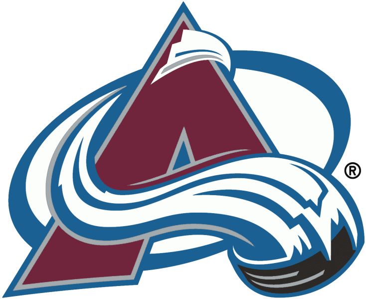
There's a reason this logo has gone untouched throughout the Avalanche's existence. The puck-led avalanche around the mountain perfectly forms the letter "A," and the swoop of snow also creates a subtle "C." The logo connects nicely to Denver's roots, too.
12. Minnesota Wild
How long did it take you to learn that this picturesque forest landscape also forms the shape of a wild animal? The path is the mouth, the shooting star (an ode to the Minnesota North Stars) is an eye, and the sun is an ear. This logo gets bonus points for uniqueness and creativity.
11. Chicago Blackhawks
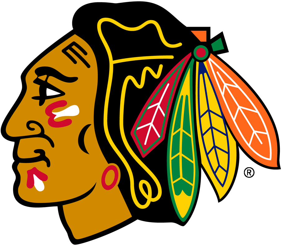
The Blackhawks' classic logo has undergone very minor changes over the franchise's near century-long existence. An artistic side profile of Black Hawk, a Native American of the Sauk nation and a prominent historical figure in Illinois, has been central to Chicago's look since the beginning. It's one of the most colorful and detailed logos in all of sports.
Copyright © 2020 Score Media Ventures Inc. All rights reserved. Certain content reproduced under license.