All posts by theScore Staff

GOAT Uniforms: ’90s dynasties, underrated gems shine as we enter top 50

"If you look good, you play good." - Deion Sanders

theScore is counting down the 100 best uniforms in sports history, with a new post every weekday until May 15.

May 4-8:
100-91 | 90-81 | 80-71 | 70-61 | 60-51
May 11-15:
50-41 | 40-31 | 30-21 | 20-11 | 10-1

50. Washington Capitals (1970s)

Focus On Sport / Focus on Sport / Getty

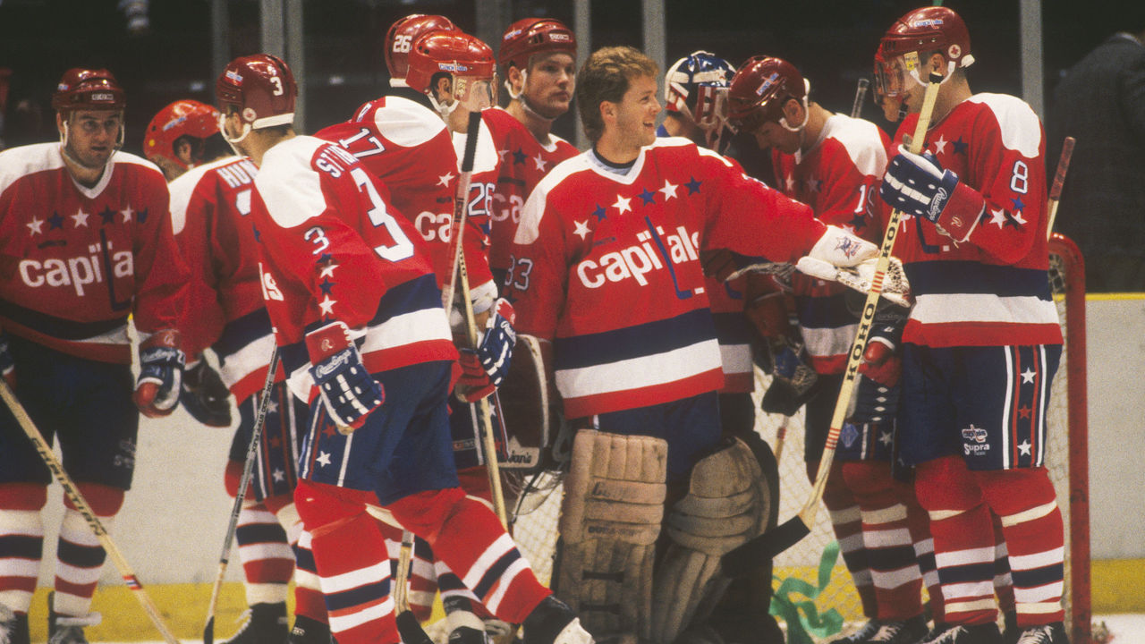
The Capitals entered the league in 1974, and they came in looking fresh. From their inception until 1995, Washington rocked these incredible red, white, and blue sweaters adorned with stars across the chest and down the sleeves and pants. The club made a very '90s switch to blue, black, and bronze, but then returned to its original colors (albeit with a modernized design) during the Alex Ovechkin era in the late 2000s. Fans are still waiting and hoping for these exact beauties to come back on a full-time basis.

49. Tennessee football (current)

Icon Sportswire / Icon Sportswire / Getty

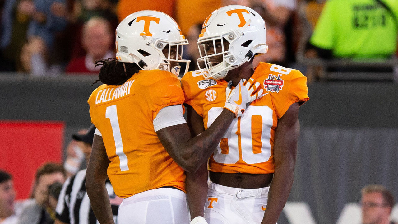
More bright colors in football, please! The Vols hit their orange and white design out of the park nearly a century ago and have stuck with it ever since. Tennessee's current getup evokes the traditions of one of the most popular programs in America, yet it also features a few modern touches - namely the font - to maintain a near-perfect balance.

48. Milwaukee Brewers (1980s)

Ron Vesely / Getty Images Sport / Getty

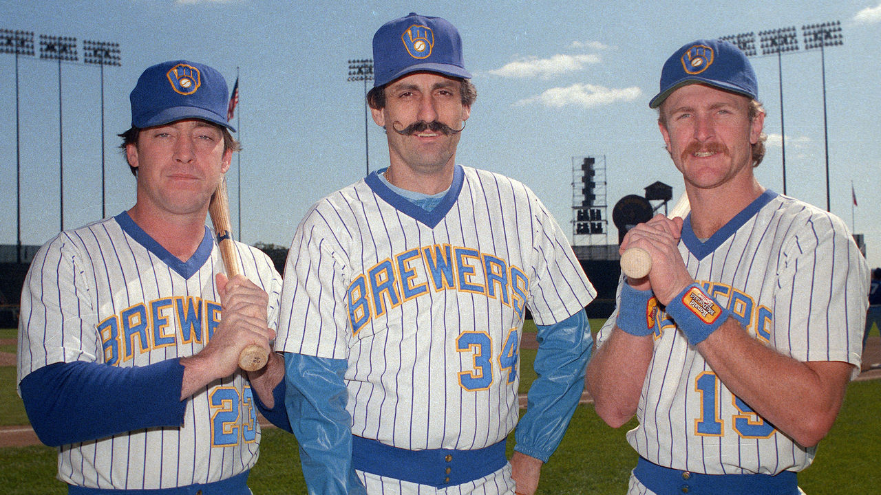
Below the shoulders, there's nothing particularly special about this uniform. It's that logo that sets it above so many others. The renowned "ball-in-glove" identifier recently made its return (with a few subtle and unnecessary tweaks), correcting a mistake made a quarter-century ago when the team ditched its wonderfully clever graphic representation of an "m" and a "b."

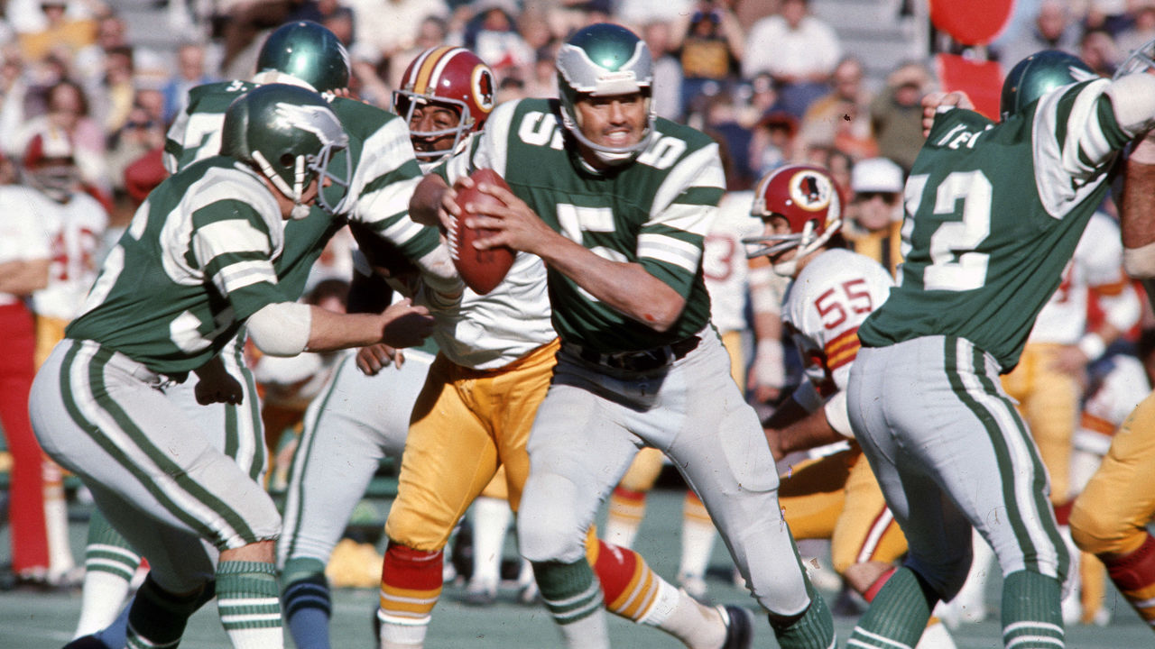
47. Pittsburgh Steelers (1970s)

Sylvia Allen / Getty Images Sport / Getty

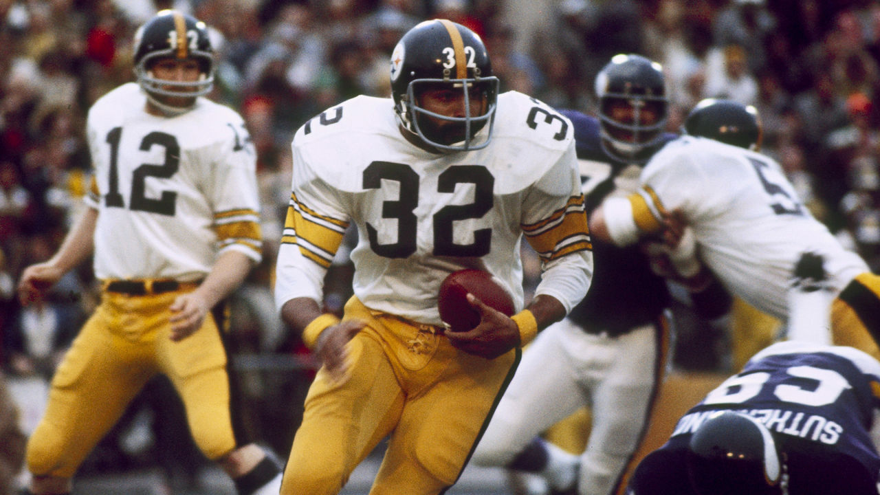
The Steelers' uniform changes over the past few decades have been minimal, but their "Steel Curtain" digs represent the team's best. So much of the franchise's identity was formed wearing these, as Pittsburgh won four Super Bowl titles from 1974-79, giving this version the nod over the current renditions. Give us standard block numbers over the current rounded and italicized number font every time.

46. Philadelphia Flyers (current)

Len Redkoles / National Hockey League / Getty

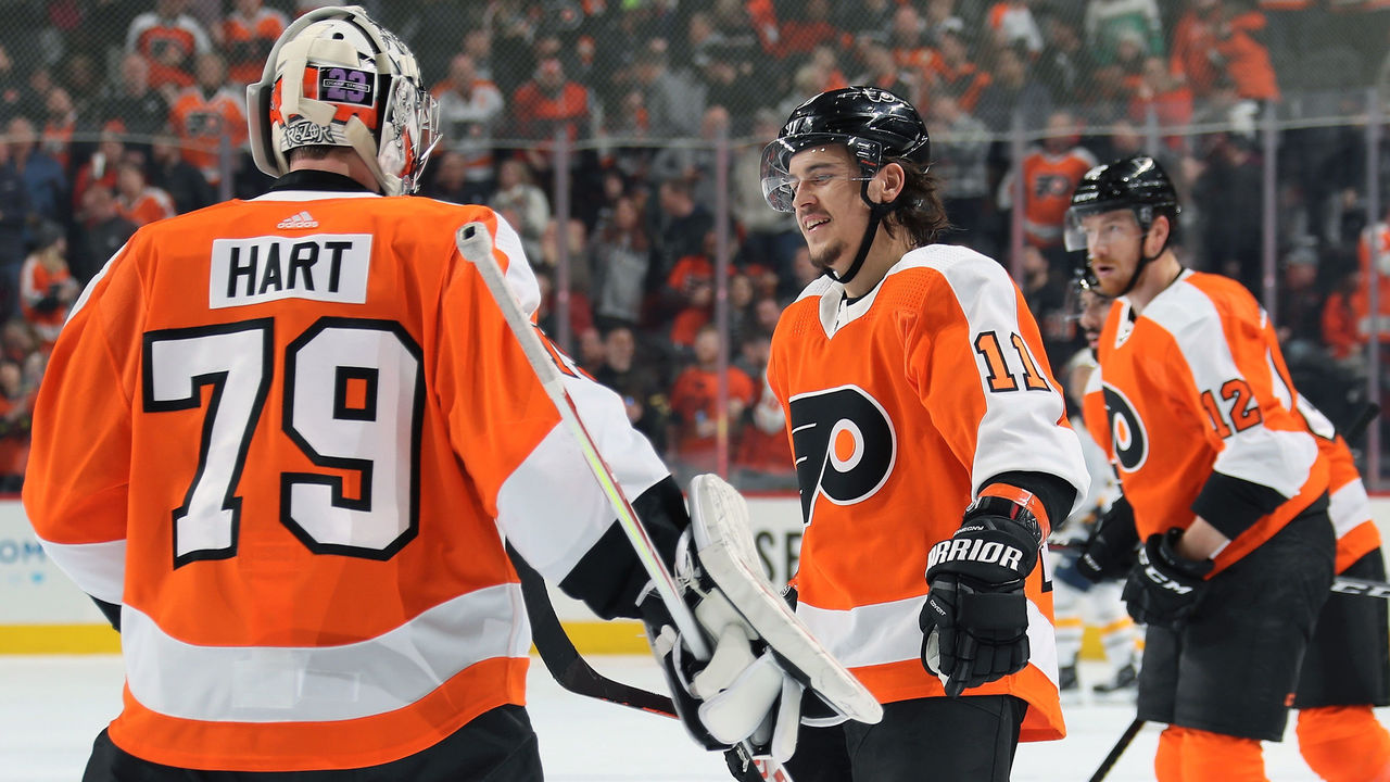
Few teams in the NHL have an identity as strong as that of the Flyers. They've always played brash, in-your-face hockey, and the vibrant shade of orange they wear at home helps drive that message into the heads of their opponents. Design-wise, the white stripe running down the entire sleeve is a look exclusive to Philadelphia, as is the block-style nameplate that helps make this uniform pop.

45. Argentina (1980s)

Peter Robinson - EMPICS / PA Images / Getty

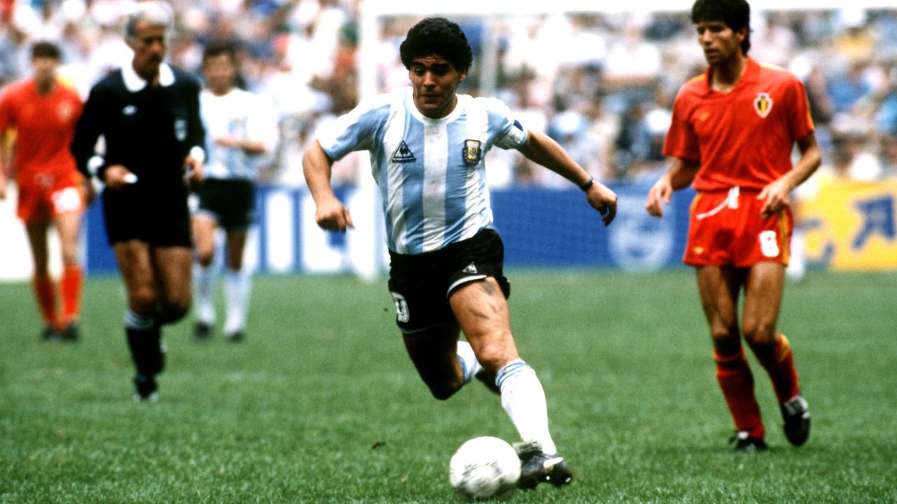
This is one of the most exemplary kits in international football, plain and simple. The sky-blue vertical stripes have been represented by dozens of legends in the beautiful game, but the simplicity of the uniforms rocked by Maradona and Co. en route to a World Cup victory in 1986 is what takes the cake. It will be a shame if we never see Messi hoist a major international trophy in these colors.

44. Indianapolis Colts (current)

Frederick Breedon / Getty Images Sport / Getty

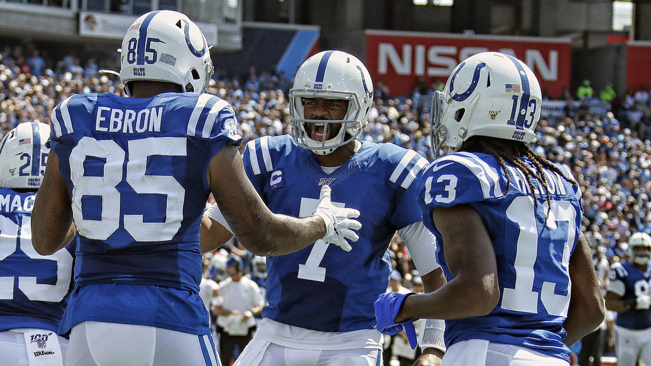
A simple single-color look is all you need sometimes, and Indianapolis' uncomplicated blue-and-white mix is always easy on the eyes. The grey facemask is probably inferior to the former blue version, but we'll give that a pass because it's a more accurate representation of what the Colts wore in their early days. Everything else, from the everlasting horseshoe logo on the helmet to the dual stripes on the shoulders and pants, makes this uniform one of the NFL's gems. The squad is updating its jersey numbers to a slightly different serifed font this season, which is a change we support.

43. Alabama football (current)

Kevin C. Cox / Getty Images Sport / Getty

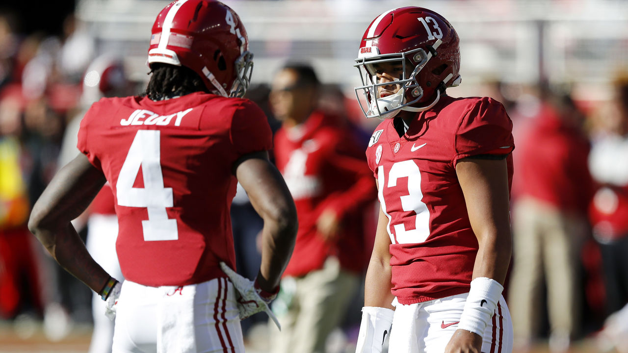
There's something truly special about watching highlights of a program like Alabama that's enjoyed an unprecedented run of success over the decades. The star players come and go, but the uniform never changes, and all that history in Tuscaloosa is interwoven in crimson. We love the simple striping on the helmet and pants, and a jersey free of everything but a player's name and number helps deliver the timeless aesthetic. The numbers on the helmet rock, too.

42. Chicago Bulls (current)

Andrew D. Bernstein / National Basketball Association / Getty

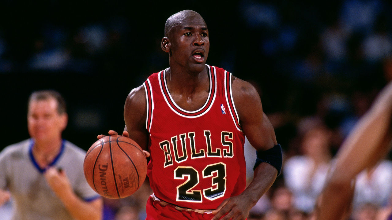
These uniforms haven't changed for decades, but we can all agree they're best represented by the Michael Jordan-led era of the '90s Bulls. MJ's dominance helped Chicago become one of the most famous franchises in the world, and the jerseys today are still instantly recognizable. Red and black is the only appropriate color scheme for the Bulls, and the bold wordmark across the chest will live on forever.

41. Dallas Cowboys (current)

Harry How / Getty Images Sport / Getty

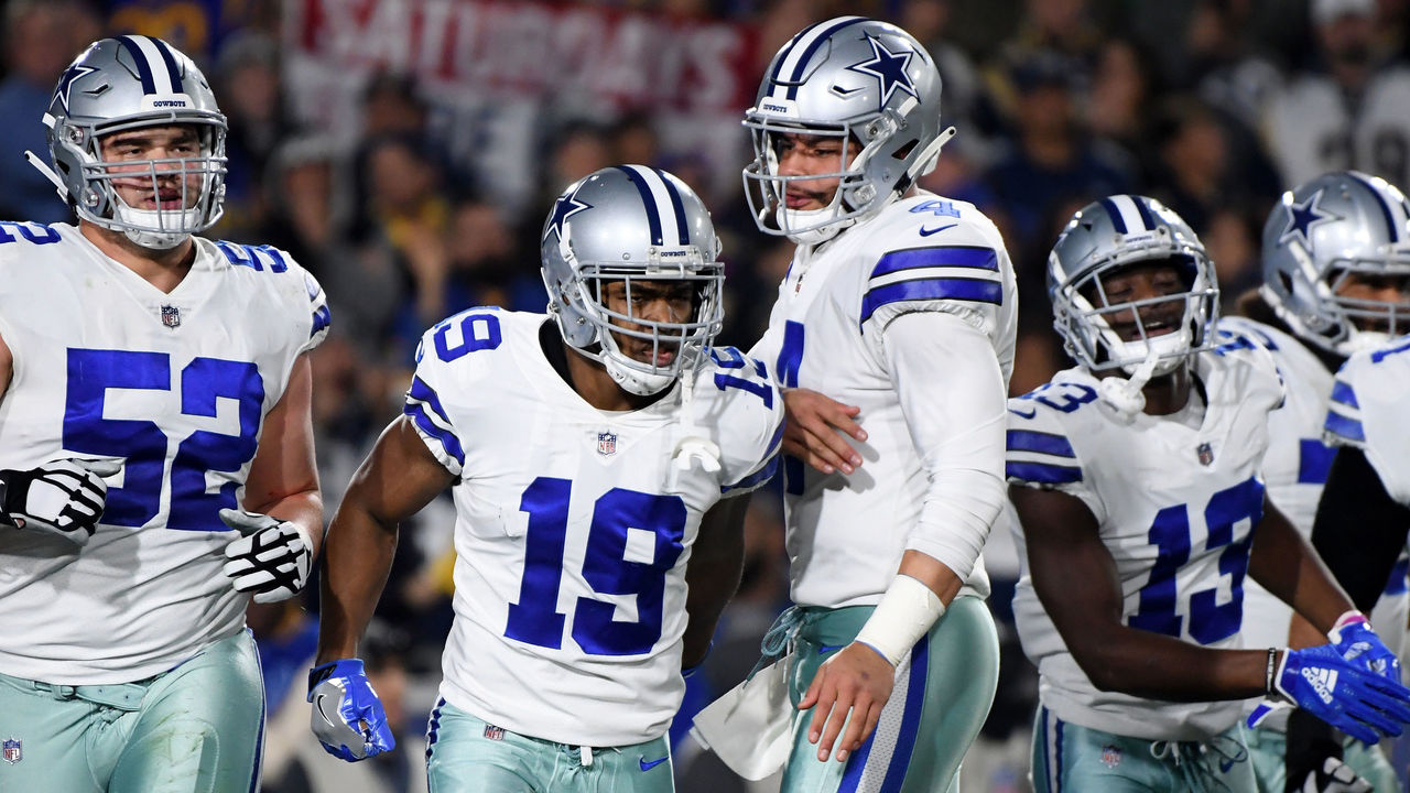
America's Team looks so good in home whites that it hardly ever finds the need to wear a different uniform. The star-branded helmets are truly iconic, and the straightforward jerseys are flat-out gorgeous, but the silvery-blue pants not quite matching the helmets is what prevents the Cowboys from being closer to the top of our list.

Copyright © 2020 Score Media Ventures Inc. All rights reserved. Certain content reproduced under license.

GOAT Uniforms: Nostalgia galore as we hit halfway mark of our countdown

"If you look good, you play good." - Deion Sanders

theScore is counting down the 100 best uniforms in sports history, with a new post every weekday until May 15.

May 4-8:
100-91 | 90-81 | 80-71 | 70-61 | 60-51
May 11-15:
50-41 | 40-31 | 30-21 | 20-11 | 10-1

60. New England Patriots (1980s)

Focus On Sport / Getty Images Sport / Getty

New England will always be remembered for the style it rocked for six Super Bowl victories in the 2000s. That's a shame, because the "Pat Patriot" era is easily the franchise's most visually pleasing look. The vibrant red, white, and blue are perfect for a team named after American patriotism, and that logo is vastly superior to the one that succeeded it.

59. Los Angeles Kings (1990s)

Andrew D. Bernstein / Getty Images Sport / Getty

After stunning the hockey world by acquiring Wayne Gretzky in 1988, the Kings decided they needed a new look. The club ditched the purple and gold it shared with the Lakers and instead opted to mimic the Raiders' silver and black. The decision was a hit, and the Kings' popularity soared thanks to their new star and sleek new colors.

58. Houston Astros (1970s)

Focus On Sport / Getty Images Sport / Getty

Not everyone thinks these jerseys are in the GOAT discussion, but we're here to praise the "Tequila Sunrise" era of the '70s Astros. These uniforms are memorable, fun, and creative - all qualities that help create a classic look. Not every baseball team needs to dress conservatively.

57. Anaheim Mighty Ducks (1990s)

B Bennett / Bruce Bennett / Getty

There's perhaps no greater cult following for a uniform in all of sports than for the Mighty Ducks' look. This cartoonish retro jersey is revered for both its appearance on the ice and for the beloved Disney movie franchise. Since new ownership took these beauties away in 2006 and rebranded the Ducks with a drab black-and-orange set, fans have been dying for the jade-and-eggplant uniforms to make a full-time comeback.

56. Boston Red Sox (current)

MediaNews Group/Boston Herald via Getty Images / MediaNews Group / Getty

There's just something special about seeing the Red Sox home uniforms under the lights of Fenway Park. Boston has tried a few different colors as alternates and toyed with the grey aways a bit too much for our liking, but the home whites have remained untouched for decades, and we hope that tradition carries on for many years to come.

55. Cleveland Browns (2000s)

Rick Osentoski / USA TODAY Sports

The Browns' decision to return to their roots in their 2020 overhaul was the right one. Cleveland's home look is at classic as it gets in the NFL, and the fact it was taken away from us for five seasons is unforgivable. The brown-and-orange color scheme is unique in a sports world filled with far too much black, red, and blue. We should celebrate it.

54. Calgary Flames (1980s)

B Bennett / Bruce Bennett / Getty

You'll be hard-pressed to find a single fan of the Flames - or of sports aesthetics in general - who thinks Calgary's current black-tinged uniforms are superior to those of the team's heyday in the '80s. The Flames still wear the red version of these timeless sweaters as throwbacks, and they wore the white version for the 2019 Heritage Classic. Teasing us with brief glimpses of these beauties instead of using them on a full-time basis is criminal.

53. Ohio State football (current)

Icon Sportswire / Icon Sportswire / Getty

When the Buckeyes take the field at the Shoe, you know they're going to look good. The scarlet-and-grey color combination is top-notch, and the consistent striping from head to toe, along with the iconic buckeye stickers littering the logo-less helmets, help make this uniform one of the all-time greats in the NCAA ranks. We don't mind the tasteful incorporation of black trim, though it's far from essential.

52. Detroit Tigers (current)

Gregory Shamus / Getty Images Sport / Getty

A timeless and quintessential uniform design. Uncomplicated, trim up the middle around the neck, and a simple font on the back. Detroit's old English-style logo is one of the best in sports, and leaving it isolated on the front of the jersey is all this kit needs to be considered one of the all-time greats.

51. New York Knicks (1990s)

Nathaniel S. Butler / National Basketball Association / Getty

The Knicks have been a punchline for years, but there's no denying New York has at least dressed well through decades of organizational futility. The orange and blue under the bright lights of Madison Square Garden will always draw attention.

Copyright © 2020 Score Media Ventures Inc. All rights reserved. Certain content reproduced under license.

Quarantine Power Rankings: Manning roasts Brady, Gritty’s got tricks

Athletes everywhere continue to get creative as they deal with their respective leagues being on hiatus. Some are better at it than others. Every Sunday throughout May, we'll look back on the week that was before crowning a quarantine king or queen. Here are the top isolation moments from the sports world over the last seven days.

10. Jazz dish out their favorite recipes

Members of the Utah Jazz recently launched their "Quarantine Cookbook." The video series provides step-by-step instructions for their favorite homemade dishes. Here's a sample of what to expect, courtesy of Royce O'Neale, who does a mean "Salt Bae" impression.

9. No rust for Russ

Sports are stopped, but the work never is for Russell Wilson. The Seattle Seahawks quarterback worked on perfecting his touch with the help of a soccer net, a training partner, and a pile of cones designed to simulate a pocket. Looking good, Russ.

8. May the 4th Be With You

The sports world, as it does every year, had plenty of fun getting creative for Star Wars Day on May 4. Whoever was responsible for animating this tennis compilation deserves a prize. Take the cake, they did.

7. Trae continues to keep busy

Whether it's playing one-on-one with his dog or competing in the NBA's Horse Challenge, Trae Young has been keeping himself busy on his driveway court throughout the quarantine period. This week, the Atlanta Hawks star impersonated all of the different AAU warmup routines.

6. No fans, no problem in Germany

The Bundesliga is set to resume May 16 after getting the green light from the German government, making it the first major soccer competition to restart since the onset of the coronavirus pandemic. In lieu of fans - who will be unable to attend matches - Borussia Monchengladbach decided to have creepy cutouts of supporters placed in the stands. For a truly authentic feel, they even made sure to include some rival fans.

5. Russell drives Albon crazy

Racing drivers are getting plenty of virtual laps in to hone their skills while on lockdown. But rising Formula 1 star George Russell is using sim races for a different purpose. The 22-year-old has apparently made it his mission to torment fellow F1 youngster Alex Albon when they race online, going out of his way to barge into his dear friend. Albon screaming "George?!" as he gets torpedoed into the wall time after time is just fantastic.

4. Manning roasts Brady for a minute

Somehow, an explanation into the selection of a course for their upcoming golf exhibition turned into a full minute of Peyton Manning absolutely roasting Tom Brady. Manning picked on Brady's recent inadvertent entry into a stranger's home in Florida and his departure from the New England Patriots, cracking up the Tampa Bay Buccaneers' new quarterback.

3. Gritty: Trick-shot master

Gritty is doing just fine in isolation, thank you very much. The Philadelphia Flyers mascot would probably make a spectacular beer pong partner.

2. James Harrison remains a beast

James Harrison doesn't play in the NFL anymore, he just pushes 1,960-pound sleds - and likely makes you feel bad about your own quarantine laziness - for fun. Let's hope somebody gifted the former Pittsburgh Steelers star another weight plate for his 42nd birthday Monday.

1. Freddie 2.0 ready for the big leagues

While Atlanta Braves first baseman Freddie Freeman was staying sharp with some at-home batting practice, his son Charlie was auditioning for the big leagues. The three-year-old totally overshadowed the four-time All-Star, most notably by showing off his fantastic home-run trot. The kid's already a star.

Copyright © 2020 Score Media Ventures Inc. All rights reserved. Certain content reproduced under license.

GOAT Uniforms: Green gridiron unis, retro hockey duds make Part 3 of our list

"If you look good, you play good." - Deion Sanders

theScore is counting down the 100 best uniforms in sports history, with a new post every weekday until May 15.

May 4-8:
100-91 | 90-81 | 80-71 | 70-61 | 60-51
May 11-15:
50-41 | 40-31 | 30-21 | 20-11 | 10-1

80. Barcelona (2014-15)

Miguel Ruiz / FC Barcelona / Getty

Red and blue is the most common color scheme in sports, but the Spanish giants are among the originators, having worn those colors since the club's foundation in 1899. Barca's vertical striped shirts are now recognized around the globe. The team has gotten a little too loose with its template in recent years while chasing merchandise dollars, even sporting hooped shirts in 2015-16, much to the dismay of fans. Give us the 2014-15 version of Barca's home kit, which was just about perfect with its simplicity.

79. Philadelphia Phillies (current)

Drew Hallowell / Getty Images Sport / Getty

The Phillies' home uniforms have largely been untouched since the '50s, and we don't see any reason to ever make significant changes. The font used across the front is one of the best in sports, and while multiple teams feature pinstripes, Philly is the only one that uses red.

78. Auburn football (current)

Kevin C. Cox / Getty Images Sport / Getty

College football has seen some ambitious uniform ideas over the years, but Auburn has stuck to a simple and effective design. Bright orange stands out nicely on the navy base, and opting for the university logo rather than using a tiger in a conference where three teams share the same nickname helps build an effective identity.

77. San Francisco Giants (current)

Lachlan Cunningham / Getty Images Sport / Getty

The Giants are one of the most storied franchises in MLB, and they look the part. With no names on the back, no numbers on the front, and a small logo on the sleeve, San Francisco nails the minimalist style. The "Giants" wordmark on the jersey and the interlocked "SF" on the front are perfect. Not to mention, the off-white base for the home uniform is absolutely beautiful.

76. Denver Nuggets (1980s)

Rocky Widner / National Basketball Association / Getty

The Nuggets' early-1980s overhaul brought about an entirely new look for the franchise - one that will live on forever as one of the most audacious in the history of sports design. The rainbow backdrop with the Denver skyline and the Rocky Mountains was a masterclass in creativity, and it hasn't been matched by the franchise in many redesign attempts. Is it over the top? Maybe. But we love the boldness.

75. Buffalo Sabres (1980s)

B Bennett / Bruce Bennett / Getty

Royal blue and yellow is the ultimate look for the Sabres, who've strayed away from their best uniform design for far too long. The logo featuring crossed swords and a charging buffalo has made a triumphant return in recent years, but the classic elements of the original uniform were missing. Thankfully, that's scheduled to change for the 2020-21 season.

74. Oregon football (2018)

Icon Sportswire / Icon Sportswire / Getty

The Ducks have worn literally dozens of different uniform combinations over the last few decades, cementing their place as the most innovative sports team on the planet when it comes to aesthetics. Not all of the combinations were winners, and everyone has a personal favorite, but the all-green look with a satin-finished winged helmet that was sported in 2018 was a particularly appealing combo.

73. Pittsburgh Penguins (current)

Icon Sportswire / Icon Sportswire / Getty

The Penguins made the switch from "Las Vegas gold" to "Pittsburgh gold" - aka yellow - in 2016. What a difference a few shades make. The Pens' digs instantly went from drab to vibrant, and they ought to remain that way from here on out. In the city of black and yellow, no team should wear anything else.

72. Buffalo Bills (current)

Brett Carlsen / Getty Images Sport / Getty

Many Bills fans have a soft spot for the red helmets of the team's Super Bowl era, or the "standing buffalo" logo of the O.J. Simpson era, but the best this team has ever looked is right now. The Bills' throwback-inspired set is tasteful and includes just enough unique quirks (like the red helmet stripe, which widens at the back to mimic the shape of the red slash on the team's logo) to stand as a modern classic.

71. Philadelphia Eagles (1970s)

Focus On Sport / Getty Images Sport / Getty

It is blasphemy for the Eagles' beloved Kelly green uniforms not to rank higher on our list? Perhaps, but in truth, there's not a ton that sets this uniform apart beyond that gorgeous color. The wings on the helmet are a little undefined (the representation on the Eagles' current midnight green helmets is superior). The 1970s jerseys with sleeve stripes are preferable to the much plainer 1960s version, which was worn by the Eagles as a throwback in 2010.

Copyright © 2020 Score Media Ventures Inc. All rights reserved. Certain content reproduced under license.

GOAT Uniforms: Sunbursts, bruised bananas highlight Part 2 of our countdown

"If you look good, you play good." - Deion Sanders

theScore is counting down the 100 best uniforms in sports history, with a new post every weekday until May 15.

May 4-8:
100-91 | 90-81 | 80-71 | 70-61 | 60-51
May 11-15:
50-41 | 40-31 | 30-21 | 20-11 | 10-1

90. Atlanta Falcons (1990s)

Al Pereira / Getty Images Sport / Getty

The Dirty Bird-era Falcons had a certain swagger about them, and these uniforms helped the cause. With no frills attached, the red trim around the numbers on the black jersey helped things pop, and it all blended perfectly with the simple stripes down the side of the pants. It's a shame Atlanta didn't go back to something similar with its recent redesign.

89. Phoenix Suns (1990s)

Sam Forencich / National Basketball Association / Getty

The Suns' vibrant purple-and-orange color scheme deserves a bold design, and the "sunburst" digs from the Charles Barkley days were the best in franchise history. The giant logo used by Phoenix helped inspire a trend mimicked across the NBA through the '90s, and many of those unis live on today as classics for an entire generation.

88. Arizona Coyotes (1990s)

Robert Laberge / Getty Images Sport / Getty

This uniform just screams '90s, but after relocating from Winnipeg to Phoenix, the Coyotes needed something to stand out from the pack. The Kachina design pays homage to Native American history in the southwestern United States, and the exclusive color scheme looks outstanding on the ice. Modernizing the look and using it as a third jersey beginning in 2018 was a brilliant decision.

87. New Jersey Nets (1970s)

Focus On Sport / Getty Images Sport / Getty

The Nets have sported some of basketball's best and worst looks across their ABA and NBA history, including an acid-washed monstrosity that lasted just the 1990-91 season. The 1970s jerseys, made famous by Dr. J, are a masterpiece of asymmetrical uniform design.

86. Arsenal (1991-93)

Neal Simpson - EMPICS / PA Images / Getty

As campy and polarizing as anything you'll find on our top 100 list, Arsenal's original "bruised banana" away kit, worn in the early 1990s, earned cult status among supporters, and Adidas recently relaunched a modern version. Even the sponsor's logo on the front (JVC is known primarily for developing the VHS video format) adds to the retro mystique.

85. New York Islanders (current)

Mike Stobe / National Hockey League / Getty

The Islanders have had some truly awful, miserable, and downright atrocious uniform ideas over the years, which is difficult to fathom considering how perfect their current home-and-away set is. This was the look the club rocked during four consecutive Stanley Cups wins in the early '80s, and now that it's back, it should never change again.

84. Denver Broncos (1980s)

Focus On Sport / Getty Images Sport / Getty

The Broncos' current navy-and-orange set is a rare '90s design that holds up today, but the best the franchise ever looked was in orange tops and royal blue helmets.

83. Hartford Whalers (1990s)

J Giamundo / Bruce Bennett / Getty

Adorned with a logo that makes the best use of negative space in sports history (once you see the H sitting on the W, you'll never unsee it), these beauties and their unique color scheme are sorely missed in the NHL.

82. Atlanta Braves (current)

Mike Zarrilli / Getty Images Sport / Getty

The Braves have donned dozens of uniforms over the course of a franchise history that dates back more than a century, but their current style is the best of the bunch. The tomahawk underlining the cursive wordmark is as iconic as it gets in MLB, and the subtle red piping surrounding the buttons and collar provides the perfect finishing touch.

81. Los Angeles Rams (1990s)

Lutz Bongarts / Bongarts / Getty

The shades of blue never quite matched between the various elements of the Rams' old uniforms, but the horned helmet is a truly inspired skeuomorphic design. Incorporating the same shape into the sleeve striping is a touch of genius.

Copyright © 2020 Score Media Ventures Inc. All rights reserved. Certain content reproduced under license.

GOAT Uniforms: Kicking off our countdown of the top 100 sports uniforms

"If you look good, you play good." - Deion Sanders

theScore is counting down the 100 best uniforms in sports history, with a new post every weekday until May 15.

May 4-8:
100-91 | 90-81 | 80-71 | 70-61 | 60-51
May 11-15:
50-41 | 40-31 | 30-21 | 20-11 | 10-1

100. New York Giants (current)

Sarah Stier / Getty Images Sport / Getty

The Giants have rocked the same style for most of their history - and for good reason. The crisp combination of red, white, and blue represents America's most iconic city perfectly. The Yankees' interlocked "NY" logo is world-famous, but don't overlook the Giants' retro-chic lowercase "ny." The 1980s throwbacks reintroduced as part of the NFL's Color Rush initiative complete one of the league's simplest and most effective uniform sets.

99. Orlando Magic (1990s)

Brian Drake / National Basketball Association / Getty

The Magic's first look was easily their best. The pinstriped black road unis stood out the most, with a blue-and-white script that truly popped. The font is very '90s but in a good way. The team's logo was created after consultation with Walt Disney World artists and consideration of thousands of suggestions submitted by fans.

98. Florida Panthers (1990s)

Mitchell Layton / Getty Images Sport / Getty

Sticking to the Sunshine State, the uniform of the '90s-era Panthers is a forgotten gem. The sharp points in the lines created a unique effect, and the crests on the chest and shoulders tied together a sweater we sorely miss. Every change the Panthers have made since their inaugural scheme has been a downgrade.

97. San Antonio Spurs (current)

Boston Globe / Getty

The Spurs always opt for simplicity, and it works. Silver and black is a timeless combination, and San Antonio gets bonus points for its seamless implementation of the logo in the wordmark. Still, is it too much to ask for the Spurs to finally use their "fiesta" logo colors in an alternate uniform?

96. Kansas basketball (1990s)

Stephen Dunn / Getty Images Sport / Getty

While the current iteration of the Jayhawks' jerseys leaves something to be desired, the "circus" number font used in their 90s-era attire helped pull together a college hoops classic.

95. Seattle Seahawks (current)

Icon Sportswire / Icon Sportswire / Getty

Nike got plenty of redesigns wrong after taking over as the NFL's uniform maker in 2012, but the company nailed the Seahawks' digs. Neon green and navy was a previously unexplored combo, and now it belongs exclusively to Seattle. It's the tasteful use of green as only trim that brings this whole set together.

94. Edmonton Oilers (1980s)

B Bennett / Bruce Bennett / Getty

The Oilers have experimented with a few different concepts since their glory days, and it's difficult to comprehend why. The simple blue-and-orange scheme repped by Wayne Gretzky and Co. at the height of the team's powers is the way to go.

93. New York Mets (1980s)

Focus On Sport / Getty Images Sport / Getty

Aside from their attempt to incorporate black as their primary color in the late 1990s, the Mets have always looked sharp. That said, their getups in the 80s - which featured pullovers instead of button-ups, thick racing stripes down the side, and pinstripes everywhere else - are easily their best.

92. Juventus (1980s)

Getty Images / Hulton Archive / Getty

While Juve might look like a team of referees to North American soccer novices, their signature black and white stripes are iconic throughout the rest of the world. Worn with only subtle changes for more than a century, these shirts are synonymous with Italian soccer dominance. Imagine if the club had stuck with its original attire: pink shirts with black ties.

91. USA Basketball (1992)

Chuck Solomon / National Basketball Association / Getty

The 1992 Olympics in Barcelona marked the first time NBAers were allowed to represent their countries at the games. It was also the debut of USA Basketball's logo, proudly displayed front and center on the U.S. national team's jerseys. The new design, tied in with the dominance of "The Dream Team" and its march to gold, created an ageless uniform.

Copyright © 2020 Score Media Ventures Inc. All rights reserved. Certain content reproduced under license.