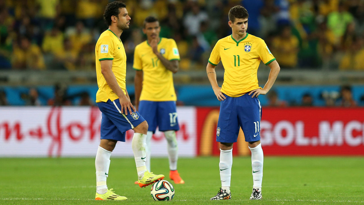
It takes a special caliber of athlete to win an MVP award. All the stars must align at just the right time to be named the premier player in a specific sport. How much do you know about the athletes who've claimed MVPs over the years? Find out by taking our quiz below.
Athletes everywhere continue to get creative as they deal with their respective leagues being on hiatus. Some are better at it than others. Every Sunday throughout May, we'll look back on the week that was before crowning a quarantine king or queen. Here are the top isolation moments from the sports world over the last seven days.
10. Harper's bat-drop in midseason form
Bryce Harper is taking the night-owl approach to his training regimen. His late-night trip to the batting cages revealed his smooth swing is right where it ought to be, but more importantly, he's got that effortless bat-drop in fine form. Someone's ready for the season to start.
With no soccer matches to play in Spain (for now), Barcelona created an animated series to keep younger fans engaged and entertained. The cartoon, "Talent Explorers," follows the adventures of a 15-year-old boy, a giant bear, and a tech-savvy kitten as they search the globe for the next Barca star.
Barça Studios to make Talent Explorers animated series
— FC Barcelona (from 🏠) (@FCBarcelona) May 15, 2020
8. Herro's short-lived hairdo
Miami Heat rookie Tyler Herro turned heads last week after unveiling his new hairdo. While he quickly ditched the look, Herro promised the braids would return. Should they, though? You be the judge.
Braden Holtby is used to saving the day for the Washington Capitals, but in quarantine, he's shifted his focus to saving stranded kittens. Holtby and a herd of civilians lured this frightened kitty out of hiding with a can of tuna. Heartwarming.
Tonight, our evening walk turned into a rescue mission to save a sweet (& very frightened) kitten who was hiding in a little hole on the Woodrow Wilson bridge! pic.twitter.com/WxXrbQMJON
Based on his crazy quarantine workouts, Baltimore Ravens receiver Marquise "Hollywood" Brown is ready to put on a show in Year 2. Pray for the NFL defenses that have to deal with the combined speed of Brown and reigning MVP Lamar Jackson.
Just like everyone else stuck in quarantine, NFL players are struggling for ways to fill their days. In a hilarious spoof video, Cleveland Browns wide receiver Jarvis Landry tries his hand at the common lockdown pastimes.
Keep-ups, unicycles, and slam dunks, all from a ... hockey player? Kudos to Nashville Predators star Filip Forsberg and his girlfriend for coordinating one of the most impressive trick shots we've seen during quarantine.
Unicycle trick shots!? Yeah, keep these coming, please. 🙏
Philadelphia Phillies outfielder Andrew McCutchen is doing his best to pass the time during quarantine, and that includes putting in work on the stationary bike ... even when he really doesn't feel like it. This week, he found a decent compromise. He's just like the rest of us trying to stay in shape right now.
Drew Brees owns the best career completion percentage (67.6%) in NFL history, and the 41-year-old showed why his accuracy is still unmatched after nailing an "underwater blind basketball trick shot" from around 40 yards away, much to the delight of his sons.
1. Brown drops Mother's Day single
Jaylen Brown and his brother Quenton may have won Mother's Day with their own rendition of 50 Cent's hit single "21 Questions." Last Sunday, the Boston Celtics star released a music video on his Instagram account showing love and appreciation for all moms. Here's the Brown family's hot track in all of its glory.
Jaylen Brown and his brother Quenton deserve a Grammy for this Mother’s Day performance. (via JB’s IG) pic.twitter.com/xyH6BKHjCz
Not all records are made equal. Some records have been set so high, or so long ago that they will never be touched. How much do you know about some of these unbreakable records? Take our quiz below to find out.
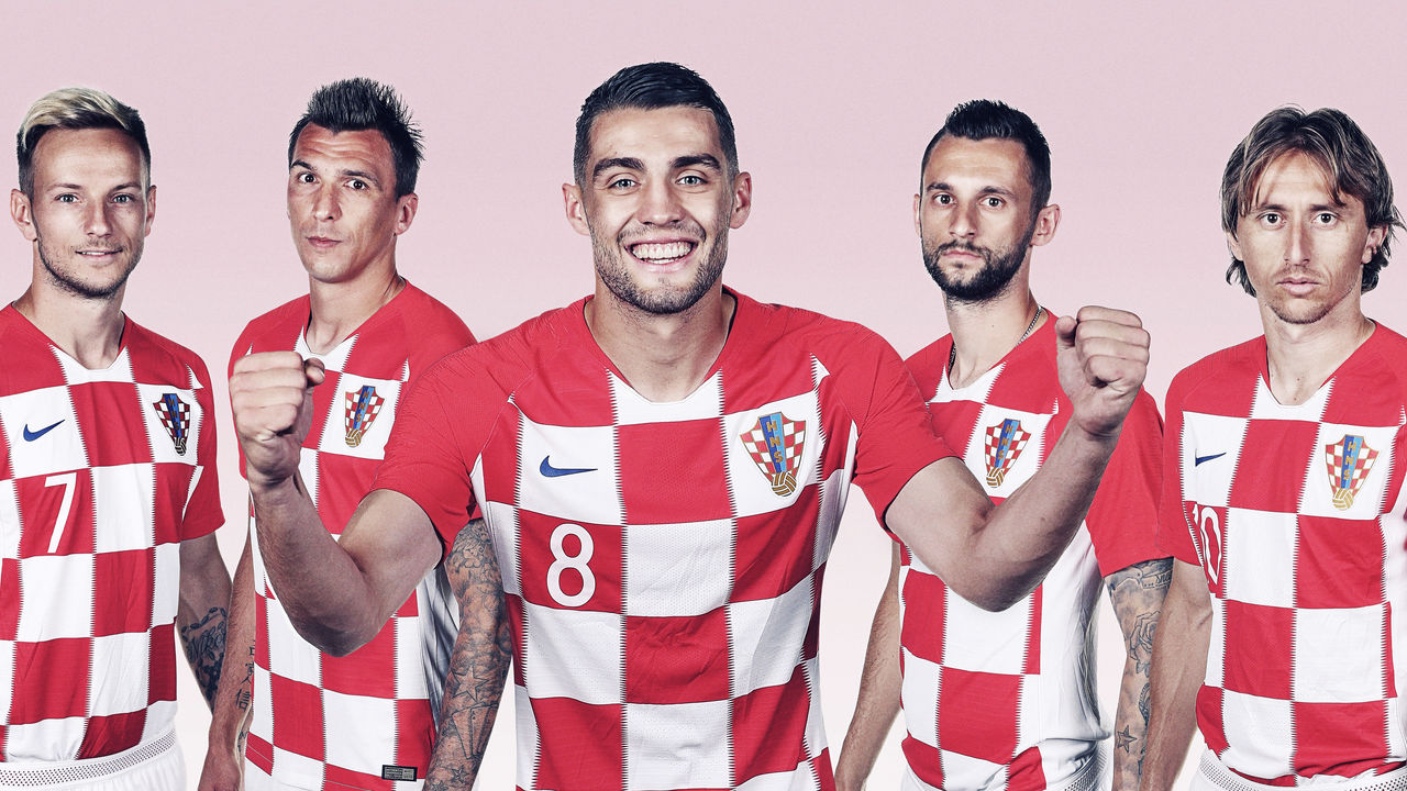
We kick off our top 10 with a uniform that, for many, will be a surprising inclusion. There is a wealth of unique and timeless kits among international soccer teams, but Croatia's distinctive look stands above all others. The red and white checkered pattern has been compared to a chessboard, a tablecloth, and even the Purina pet food logo. However, the motif is actually based on the country's coat of arms, a tremendous source of pride for Croatians.
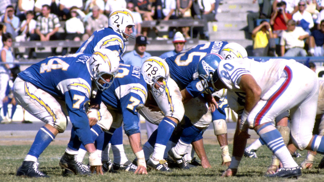
9. San Diego Chargers (1960s)
Richard Stagg / Getty Images Sport / Getty
The Chargers' uniforms have been tweaked and redesigned many times over the years, rarely producing an unappealing result. Many fans are often torn between the royal blue helmets and yellow pants of the 1970s, the navy blue base and white lightning bolts of the 1990s, or the navy and powder blue combo sported by the team until last month's redesign that aimed to combine all the eras. But for us, and it's fair to say for most others, the Chargers have never looked better than they did in the mid-1960s. Lightning bolts as stripes might be a little hokey if they weren't so damn cool.
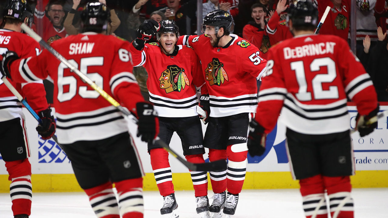
8. Chicago Blackhawks (current)
Jonathan Daniel / Getty Images Sport / Getty
Thanks to three Stanley Cups from 2010 to 2015, the Blackhawks' timeless style - which more or less has been the same since 1955 - regained clout. Chicago lost its place among hockey's top franchises thanks to shoddy ownership before its resurgence last decade. However, the club has always looked great on the ice through it all. The vibrant home red jersey, complemented by matching double stripes at the elbow, waist, and socks, has long been one of the best in hockey. Factor in the beautifully colorful crests on the front and shoulders, and the Blackhawks' everlasting aesthetic is undeniably great.
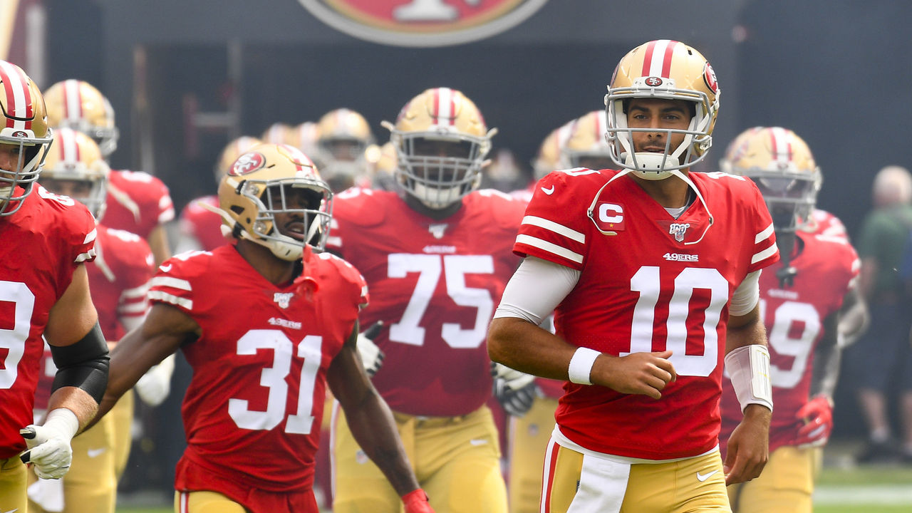
7. San Francisco 49ers (current)
Icon Sportswire / Icon Sportswire / Getty
Joe Montana made the 49ers' persona famous as he dominated the 1980s, and after an experiment with black accent colors - a trap they certainly weren't the only to fall into - for the decade-plus that followed, San Francisco's look is back as it belongs. A simple red jersey is brought to life with gold helmets and pants, consistent striping patterns, and the aura of an unforgettable dynasty that produced some of football's most famous moments. When the Niners rock their reds under the Bay Area sun, they practically glow.
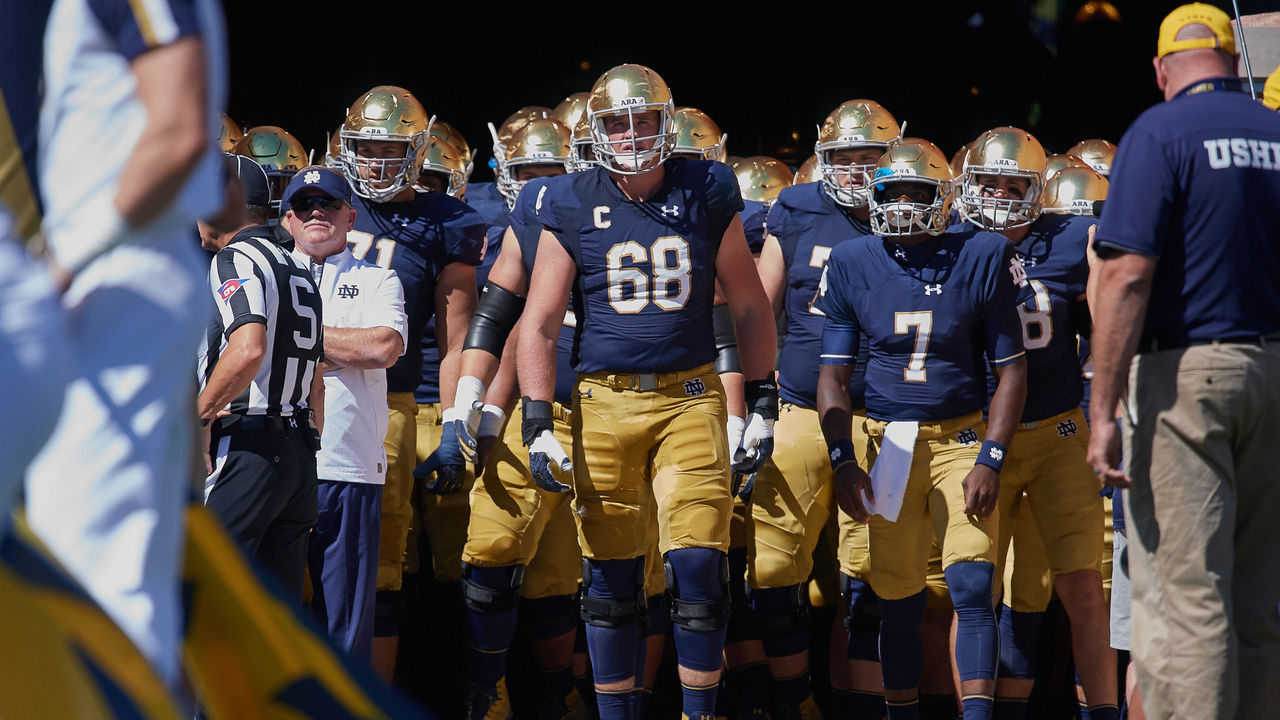
6. Notre Dame (current)
Icon Sportswire / Icon Sportswire / Getty
There are no neutral feelings toward Notre Dame. The Fighting Irish have one of the largest and most loyal followings in America, but if you don't fall on the supporters' side, there's a good chance you despise everything about their football program. Love them or hate them, we can all agree Notre Dame looks good. Navy and gold - 24-karat gold, in fact, for the fabled blank helmets - is all Notre Dame needs to deliver the best look in college football.
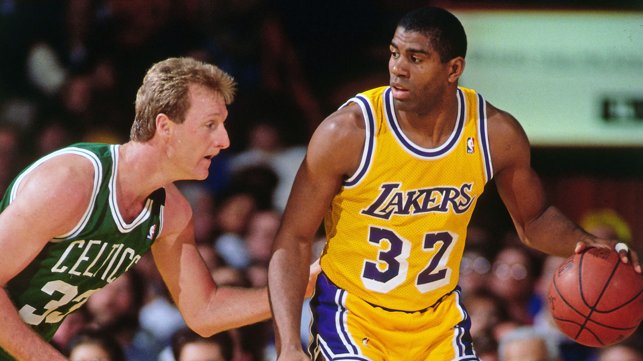
5. Los Angeles Lakers (1980s)
Andrew D. Bernstein / National Basketball Association / Getty
The Lakers not only won five championships in the 1980s, but they also created the NBA's most recognizable and globally popular uniform. The digs worn by Magic Johnson and Co. are the quintessential Los Angeles design, featuring a famous drop shadow on the purple numbers the club moved away from during the Kobe Bryant era, which coincidentally yielded five titles, as well. But when LeBron James came to town, L.A. brought back its old look, but today's jersey sponsorships and other minor details don't quite match the lore that surrounds the "Showtime" Lakers.
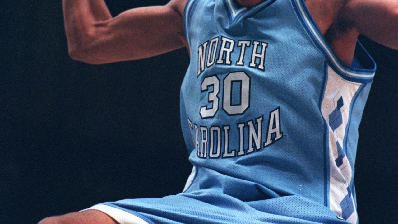
4. North Carolina basketball (1990s)
Andy Lyons / Getty Images Sport / Getty
The Tar Heels' "Carolina blue" has always looked amazing, but legendary head coach Dean Smith wanted something new in the 1991-92 season, and designer Alexander Julian introduced the world to the argyle pattern still used and revered in 2020. There have been several gorgeous renditions since, but UNC's original redesign - also accompanied by a bigger, bolder wordmark and more detailed trim than on today's uniforms - gets the nod for the best look the storied university has ever used.
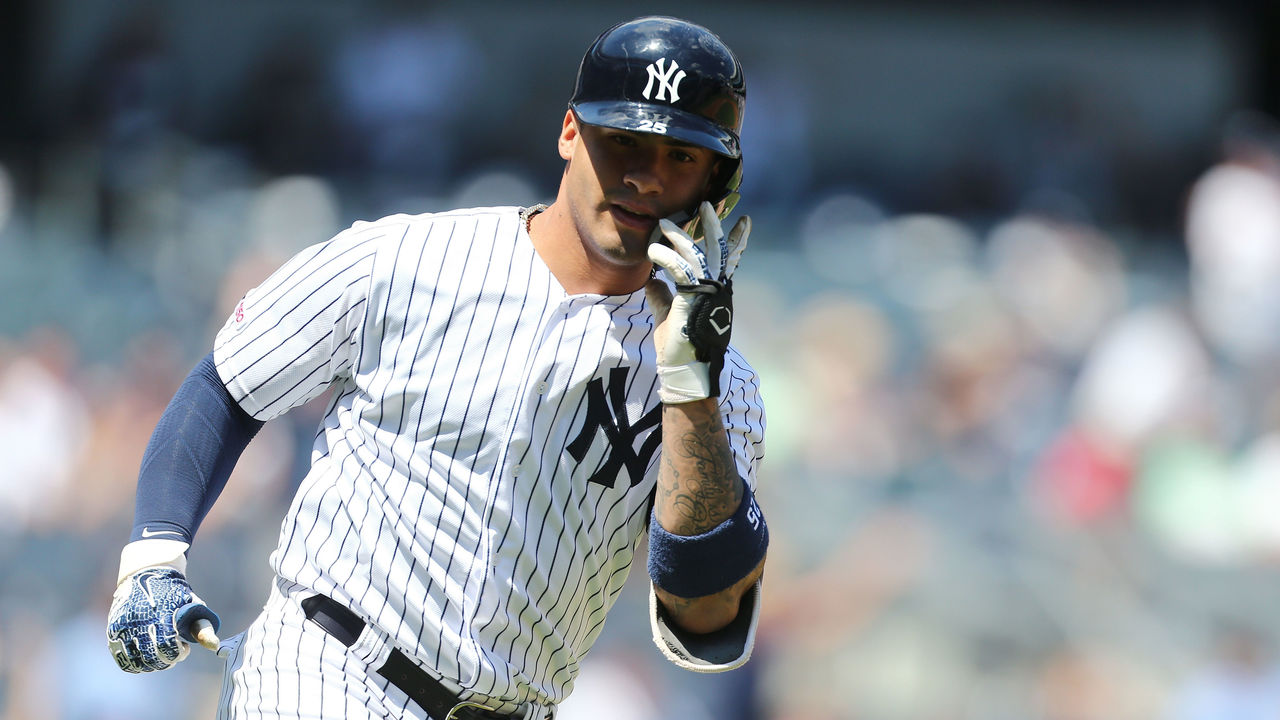
3. New York Yankees (current)
Mike Stobe / Getty Images Sport / Getty
There aren't many elements to these uniforms, but every single one of them - the pinstripes, the interlocked "NY" on the cap and over the heart, and the absence of player names on the back - is iconic. Would these rank so high if the Yankees achieved a similar level of success as the Detroit Tigers (another team with a simple and timeless uniform) and not won 27 World Series titles? It's impossible to say, as you can't separate the memories of all the Bronx Bombers legends who've worn this uniform over the last century from the design itself. Pinstripes have become, and will always be, synonymous with greatness.
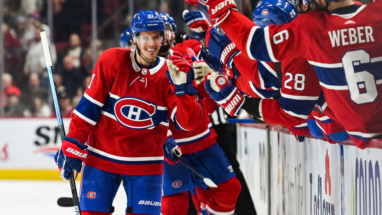
2. Montreal Canadiens (current)
Icon Sportswire / Icon Sportswire / Getty
The most untouchable uniform in all of hockey. The Canadiens' classic red sweater has been almost exactly the same since the dawn of the NHL in 1917, and its signature touch is the blue stripe around the middle, creating the perfect backdrop for a logo that's also undergone minimal changes for more than a century. Montreal's uniform scheme is so iconic that the club has opted to make use of a third jersey only once, and while the Habs' look has slightly modernized over time, aspects of their historic getups - namely, the white collars and laces - have rightfully lived on. There's simply no team that does tradition like the Canadiens.
1. Las Vegas Raiders (current)
Jed Jacobsohn / Getty Images Sport / Getty
The Raiders have made plenty of mistakes on and off the field over their history in Oakland, Los Angeles, Oakland again, and now Las Vegas. But one thing they got exactly right was their uniforms. The black and silver debuted in 1963 - following a three-year stint during which the team used gold instead of silver - and hasn't been touched since. Players put on these uniforms and instantly take on a menacing villain aura, which is exactly the mindset you want when brute force and physical dominance are paramount. Nothing has ever given a team more street cred than when rap group N.W.A. made Raiders gear a staple of their early-90s fashion. Since then, it seems as though half the teams in professional sports have introduced a black alternate jersey. And they were all, to some extent, trying to emulate the Raiders.
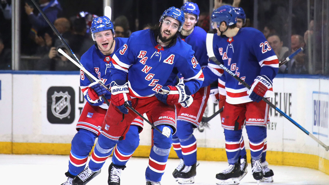
So much stands out when analyzing what make makes New York's uniforms gleam. The drop shadow on the iconic diagonal "Rangers" wordmark pops, and it looks even better on the big red numbers on the back of the sweaters. Elsewhere, bright red pants and quiet striping patterns define the identity of the NHL's most glamorous team.
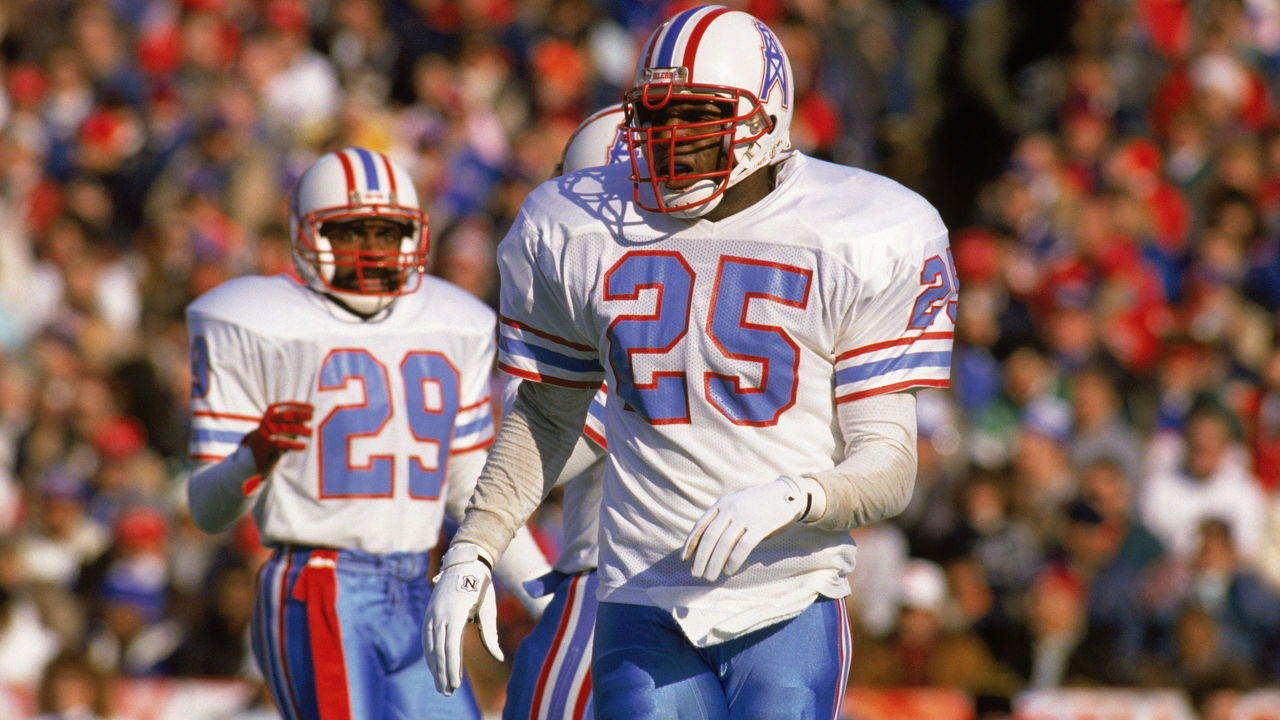
19. Houston Oilers (1980s)
Rick Stewart / Getty Images Sport / Getty
Perfect uniformity of striping. It's rarer than you might think among the hundreds of pro sports uniforms. And it's arguably never looked better than it did on the defunct Oilers uniforms, with their gorgeous, and rare, color palette. Red, white, baby blue, white, red. Those stripes in that exact pattern are there on the helmet, sleeves, and pants. Home and road. Perfect uniformity. J.J. Watt is among the Houston Texans players who would love the chance to wear these as throwbacks, but the Tennessee Titans own the rights and aren't likely to gift them to their divisional rivals.
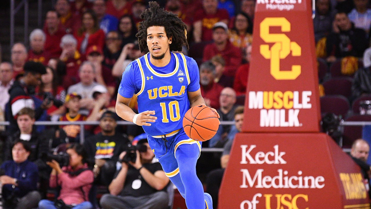
18. UCLA basketball (current)
Icon Sportswire / Icon Sportswire / Getty
College basketball's most accomplished program, with a record 11 national championships, UCLA has looked the part for decades with a luminescent combination of bright blue and yellow, which confidently counterpunches the red donned by archrival USC. Both looks are great, but we're giving the edge to the Bruins in the battle of Los Angeles.
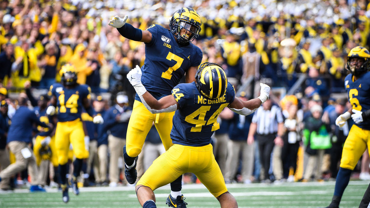
17. Michigan football (current)
Icon Sportswire / Getty Images
Back in the '30s, Michigan made an effort to shift away from the black-and-brown helmets worn by almost everyone else and invented the "winged" design still in use today. The maize and blue combination is remarkable on the jerseys and pants, too, but the Wolverines' lids are unquestionably one of the most instantly recognizable uniform features in sports.
16. Detroit Red Wings (current)
Gregory Shamus / Getty Images Sport / Getty
Detroit's winged-wheel logo is so untouchable that, at one point, the Red Wings were the only NHL franchise to put captain's letters on the right side of the jersey in order to leave the famous crest unimpeded. We respect that immensely, and we also appreciate how the club has never added a third color into the mix.
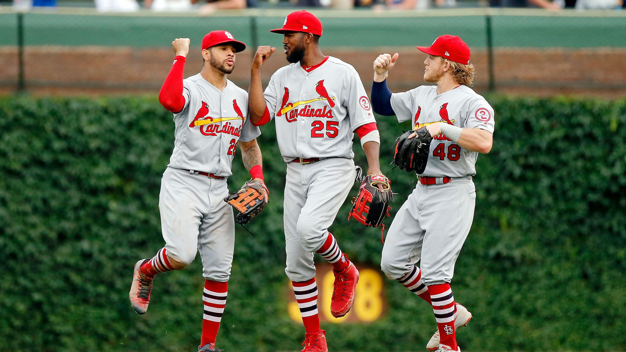
15. St. Louis Cardinals (current)
Jon Durr / Getty Images Sport / Getty
The Cardinals have a certain magic about them as one of baseball's model franchises. Part of it is the vast collection of Hall of Famers they've produced and the 11 World Series titles they've collected. Part of it is playing in a gorgeous ballpark. But don't overlook the uniforms. The two birds sitting on the bat is timeless and creative, and whether the Cards are wearing their homes, roads, or alternates, it's difficult to identify a single flaw in their setup.
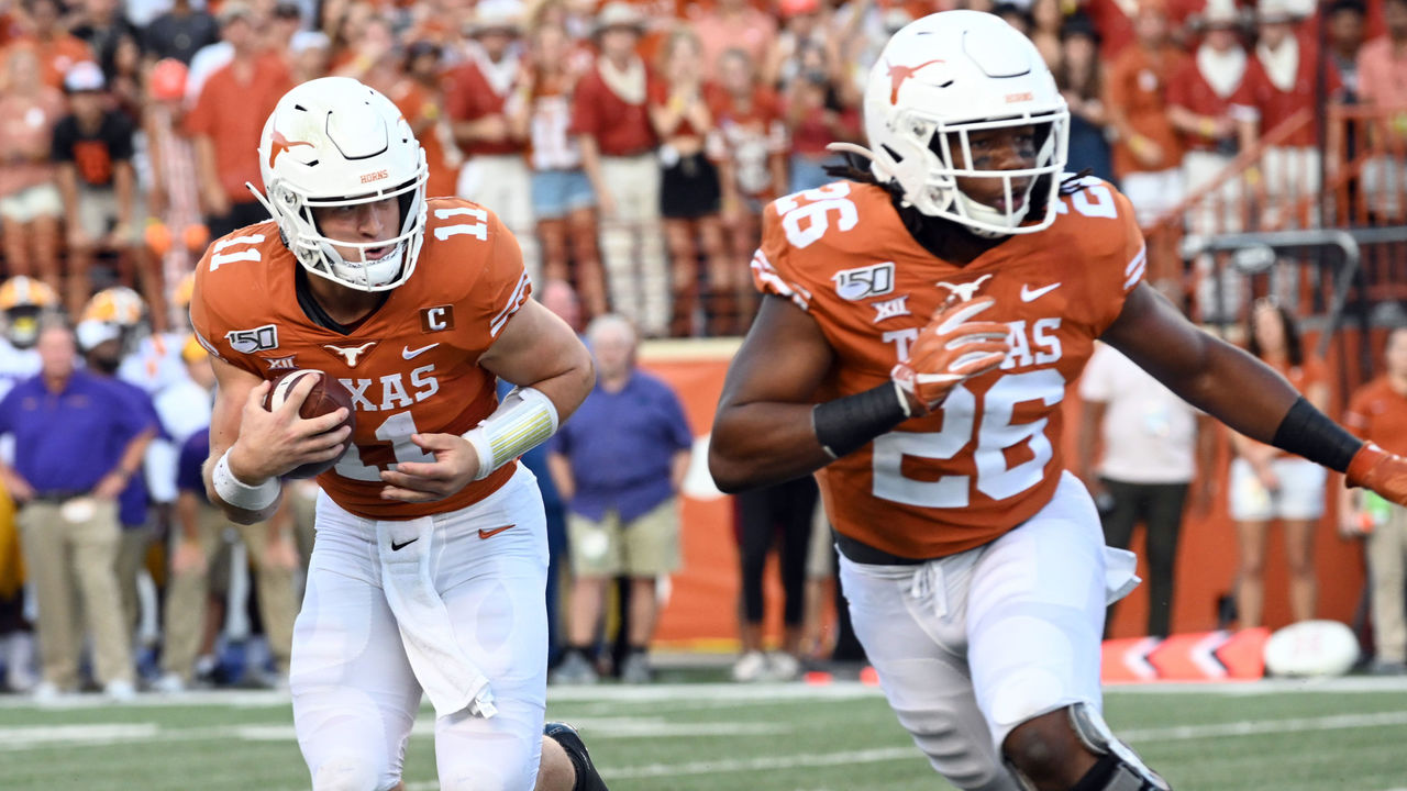
14. Texas (football)
Icon Sportswire / Icon Sportswire / Getty
There aren't many better atmospheres in sports than 100,000-plus ballistic Longhorns fans packed into Texas Memorial Stadium on a sunny Saturday in the fall, clad in burnt orange. The unique color is exclusive to Texas' historic program and features so many likable qualities: the minimalist longhorn outline on the helmet; the accent stripes on the sleeves; the all-white pants. The giant "Texas" across the chest is even acceptable, because we all know everything is bigger down there.
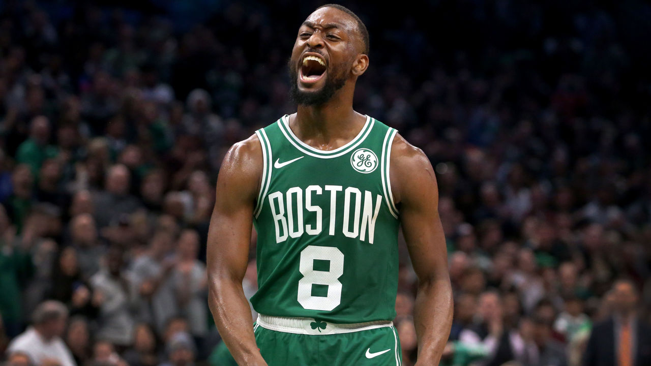
13. Boston Celtics (current)
Boston Globe / Getty Images
The Celtics have repped green and white to a record 17 NBA titles and formed an everlasting image along the way. Boston's experimented with black and gold over the years, which is difficult to fathom considering the club's regular set is flawless. Bonus points for the subtle shamrock feature on the waistband.
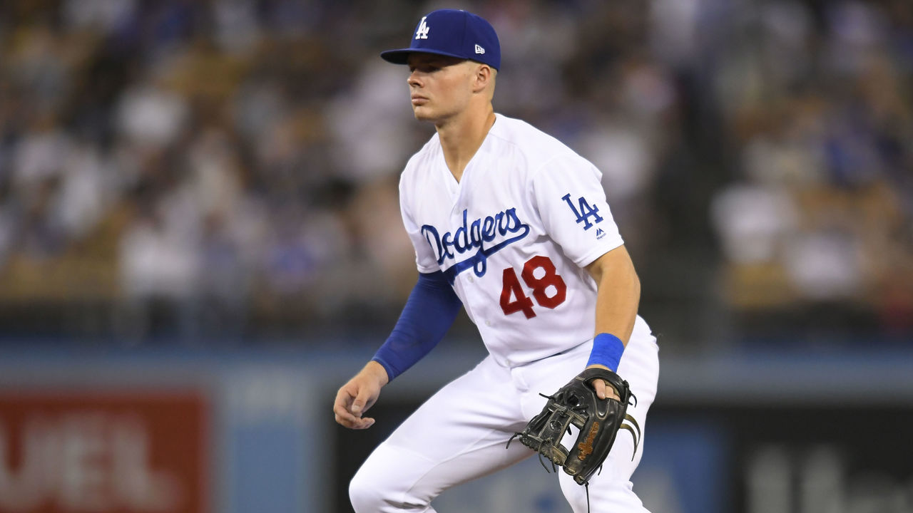
12. Los Angeles Dodgers (current)
John McCoy / Getty Images Sport / Getty
Does it get any cleaner than this? The Dodgers' home whites are beautiful, and any notable changes to them would cause a significant uproar from the world's uniform purists. The cursive font and famous "LA" logos on the sleeve and hat are nice on their own, but the bright red numbers on the front are a special tradition that puts a bow on arguably baseball's best getups.
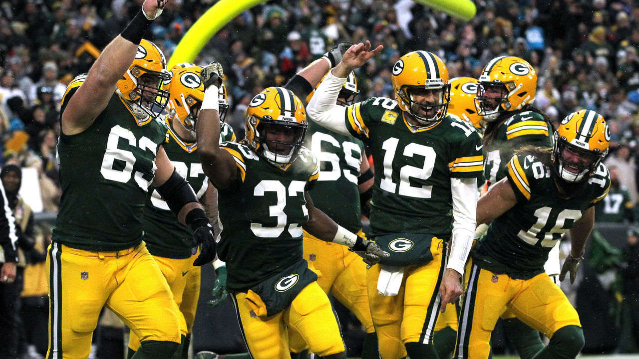
11. Green Bay Packers (current)
Dylan Buell / Getty Images Sport / Getty
No logo changes, no color changes. The Packers have stuck with what works for decades. Even though they often play through dark and dreary conditions at Lambeau Field, Green Bay's uniforms always shine through as one of the most aesthetically pleasing in football and in all of sports. Green. Gold. Greatness.
Few things are more exciting than a last-second win. But how much do you know about some of the most epic buzzer-beaters and walk-off victories in sports history? Take our quiz below to find out.
You could draw three stripes - yellow, blue, white - and every soccer fan on the planet would instantly know what they represent. The five-time World Cup winners first donned their iconic kit in 1954 following the national tragedy that was a home defeat to Uruguay at the 1950 World Cup in all-white attire. A newspaper ran a contest to design a new strip for the national team that needed to incorporate all four colors of Brazil's flag: green, yellow, blue, and white. A 19-year old illustrator won the prize, in part thanks to his genius idea to use green merely as trim on the yellow shirts.
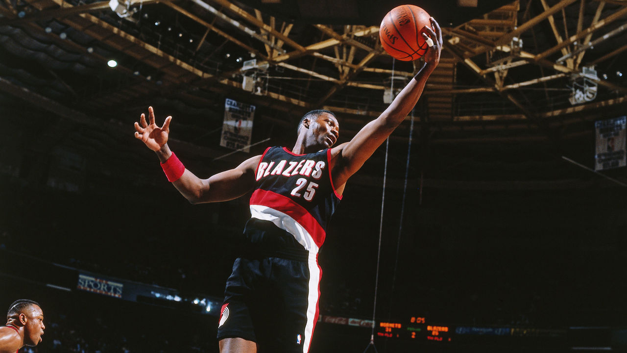
39. Portland Trail Blazers (1990s)
Nathaniel S. Butler / National Basketball Association / Getty
The Blazers' diagonal jersey stripe debuted in the '70s but was perfected in the '90s. The fluidity of the design running down the side of the shorts is magnificent work, and the pinwheel logo on the opposite leg, along with a bolder wordmark than in years past, created a uniform that never needs to be altered.
38. Real Madrid (2011-12)
ullstein bild / ullstein bild / Getty
The panache and glamor of Real Madrid live vicariously through their all-white kits. Owning perhaps the most iconic look in all of Europe on a year-to-year basis, Los Blancos' style peaked in 2011-12 with a look that featured collars and gold trim. Really, though, pick any given year and you'll find one of the cleanest and classiest home kits in all of footy.
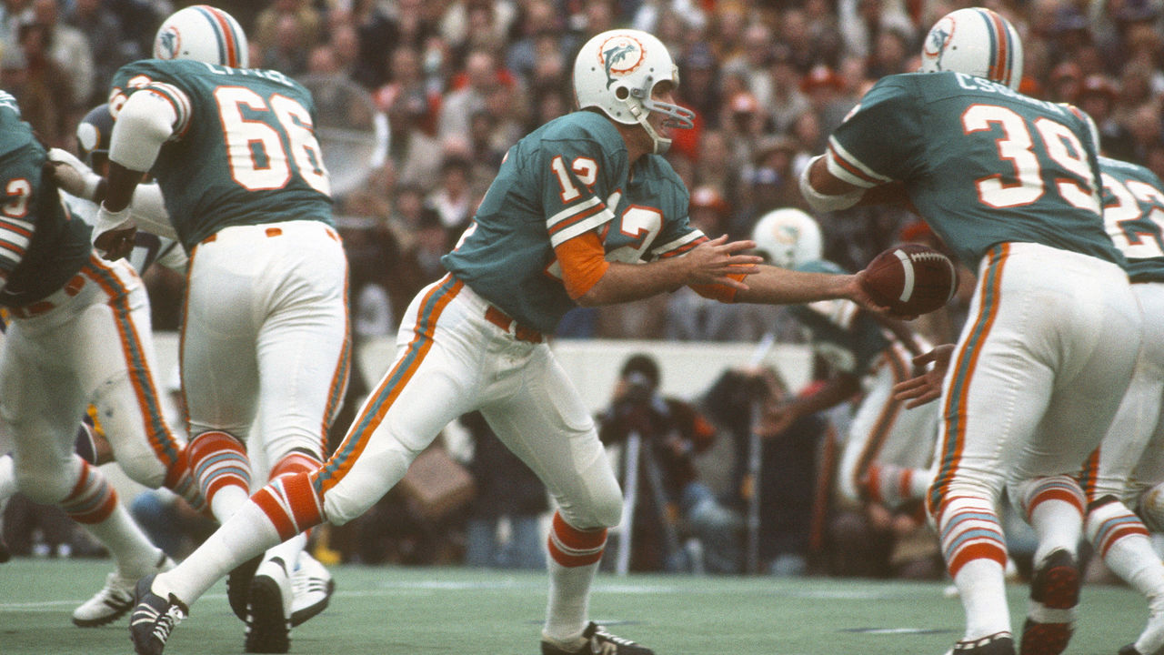
37. Miami Dolphins (1970s)
Focus On Sport / Getty Images Sport / Getty
Not only did the Dolphins produce a perfect season in 1972, but they also owned perfect uniforms. The aqua and orange combo sparkles to this day, but the prime years of Miami's franchise and uniforms also featured the ideal jersey and sock stripes, along with a cartoonish yet brilliant helmet logo. It's no wonder today's Dolphins are showered with praise any time they break out their '70s throwbacks.
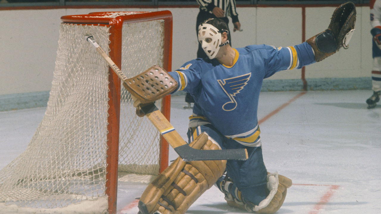
36. St. Louis Blues (1970s)
Denis Brodeur / National Hockey League / Getty
After joining the NHL in the league's first wave of expansion in 1967, the Blues opened eyes by making the Stanley Cup Final in each of their first three seasons. They also made an immediate impact by looking incredible as soon as they took the ice, donning uniforms that rivaled those in the "Original 6." St. Louis' blue was unique compared to those of the Maple Leafs, Rangers, and Canadiens back in the day, and the dull yellow complemented it exquisitely. Shifting to darker shades is a decision we wish the Blues never made.
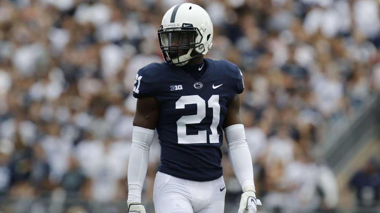
35. Penn State football (current)
Justin K. Aller / Getty Images Sport / Getty
It's difficult to conceive of a more simple uniform than the Nittany Lions' white stripeless pants, navy blue stripeless home jerseys, and logo-less white helmets adorned with a single navy stripe. In this case, simplicity is pretty close to perfection.
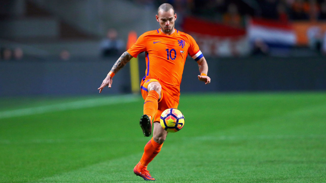
34. Netherlands (2016)
Dean Mouhtaropoulos / Getty Images Sport / Getty
The flag of the Netherlands is red, white, and blue, but the Dutch aren't counted among the too-long list of sports teams donning those three colors. Instead, they've carved out perhaps the most unique and famous look in international sports by wearing the colors of the House of Orange, the Dutch Royal Family. The throngs of orange-clad fans who follow the Netherlands' national soccer teams create a home stadium atmosphere anywhere on the planet.
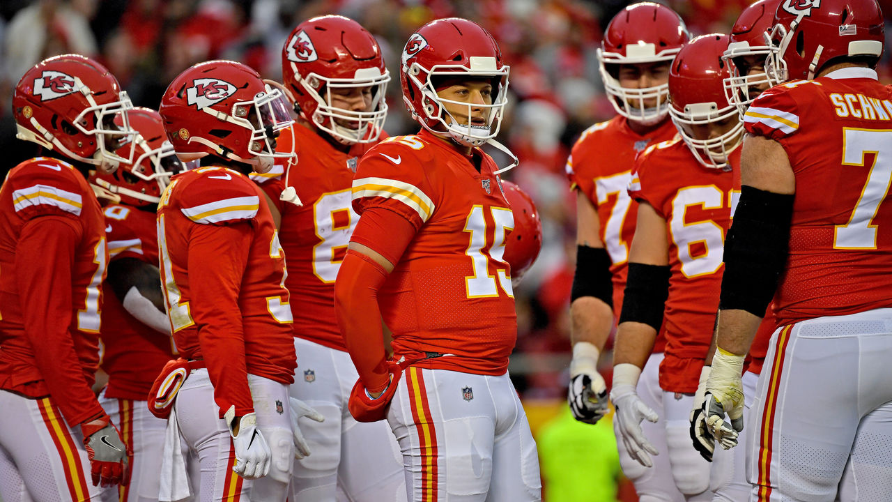
33. Kansas City Chiefs (current)
Peter G. Aiken / Getty Images Sport / Getty
Full credit to the Chiefs for never entertaining the idea of redesigning their traditional uniforms, as tempting as it may have been, over the decades that passed between their Super Bowl appearances. Now, with the best football player alive donning red and yellow, the Chiefs' classic look has a new sheen. Those bright colors really pop under the September sun in Arrowhead, but they also look great on a snowy Sunday night in January.
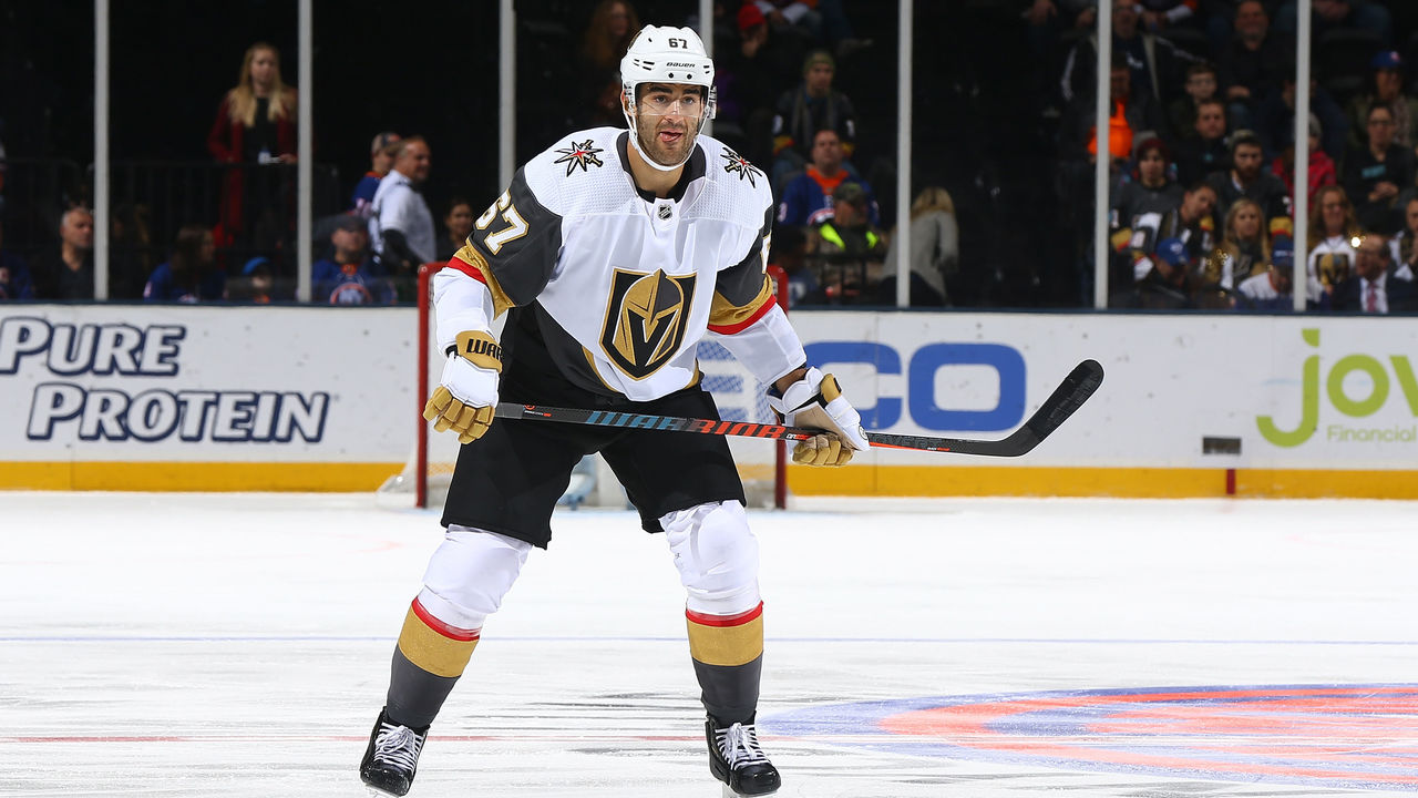
32. Vegas Golden Knights (current)
Mike Stobe / National Hockey League / Getty
The Golden Knights needed to make a splash with their identity as Sin City's first professional franchise. And as if making the Stanley Cup Final in their expansion season wasn't enough, they also happened to settle on a perfect contemporary design. Vegas opted for granite, gold, white, and a clever dash of red. The use of white gloves with the road uniforms was a phenomenal touch, one that bucked the conservative nature that consistently holds hockey back.
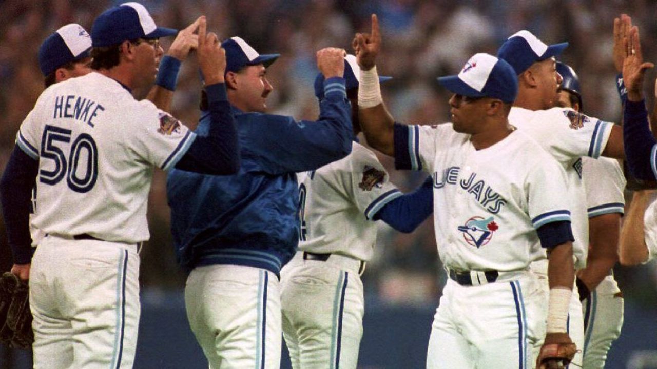
31. Toronto Blue Jays (1990s)
ROBERT SULLIVAN / AFP / Getty
The Blue Jays' digs are sharp today, but the original look that provided the inspiration for Toronto's current uniforms was even better. The tri-color hat is an all-time classic, and the use of baby blue in the logo and stripes is a style forever immortalized thanks to the club's back-to-back World Series titles in the early '90's.
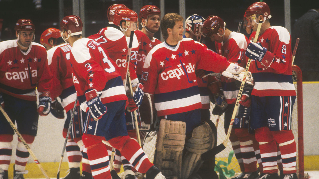
The Capitals entered the league in 1974, and they came in looking fresh. From their inception until 1995, Washington rocked these incredible red, white, and blue sweaters adorned with stars across the chest and down the sleeves and pants. The club made a very '90s switch to blue, black, and bronze, but then returned to its original colors (albeit with a modernized design) during the Alex Ovechkin era in the late 2000s. Fans are still waiting and hoping for these exact beauties to come back on a full-time basis.
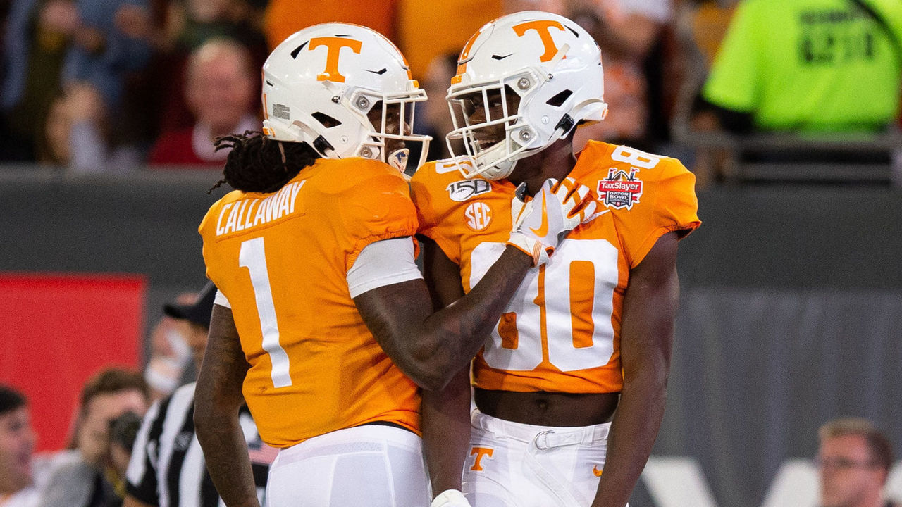
49. Tennessee football (current)
Icon Sportswire / Icon Sportswire / Getty
More bright colors in football, please! The Vols hit their orange and white design out of the park nearly a century ago and have stuck with it ever since. Tennessee's current getup evokes the traditions of one of the most popular programs in America, yet it also features a few modern touches - namely the font - to maintain a near-perfect balance.
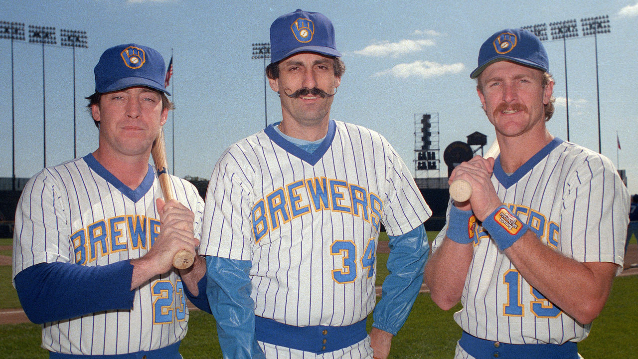
48. Milwaukee Brewers (1980s)
Ron Vesely / Getty Images Sport / Getty
Below the shoulders, there's nothing particularly special about this uniform. It's that logo that sets it above so many others. The renowned "ball-in-glove" identifier recently made its return (with a few subtle and unnecessary tweaks), correcting a mistake made a quarter-century ago when the team ditched its wonderfully clever graphic representation of an "m" and a "b."
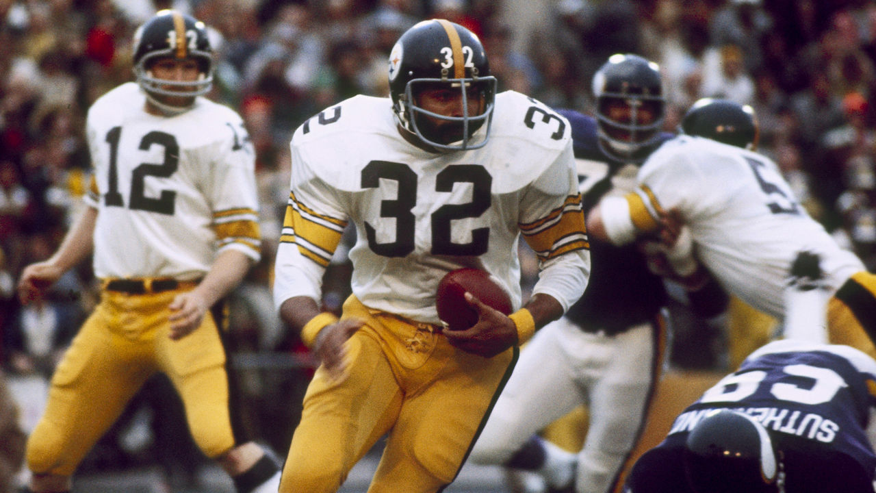
47. Pittsburgh Steelers (1970s)
Sylvia Allen / Getty Images Sport / Getty
The Steelers' uniform changes over the past few decades have been minimal, but their "Steel Curtain" digs represent the team's best. So much of the franchise's identity was formed wearing these, as Pittsburgh won four Super Bowl titles from 1974-79, giving this version the nod over the current renditions. Give us standard block numbers over the current rounded and italicized number font every time.
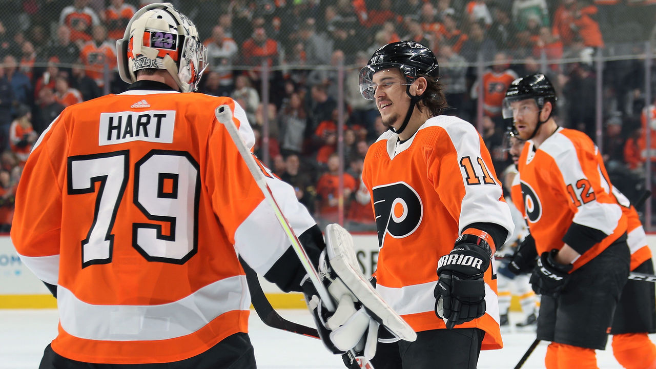
46. Philadelphia Flyers (current)
Len Redkoles / National Hockey League / Getty
Few teams in the NHL have an identity as strong as that of the Flyers. They've always played brash, in-your-face hockey, and the vibrant shade of orange they wear at home helps drive that message into the heads of their opponents. Design-wise, the white stripe running down the entire sleeve is a look exclusive to Philadelphia, as is the block-style nameplate that helps make this uniform pop.
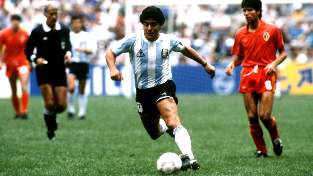
45. Argentina (1980s)
Peter Robinson - EMPICS / PA Images / Getty
This is one of the most exemplary kits in international football, plain and simple. The sky-blue vertical stripes have been represented by dozens of legends in the beautiful game, but the simplicity of the uniforms rocked by Maradona and Co. en route to a World Cup victory in 1986 is what takes the cake. It will be a shame if we never see Messi hoist a major international trophy in these colors.
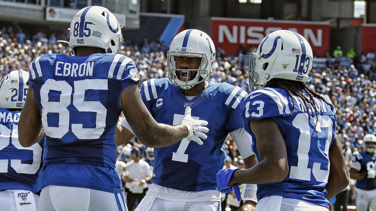
44. Indianapolis Colts (current)
Frederick Breedon / Getty Images Sport / Getty
A simple single-color look is all you need sometimes, and Indianapolis' uncomplicated blue-and-white mix is always easy on the eyes. The grey facemask is probably inferior to the former blue version, but we'll give that a pass because it's a more accurate representation of what the Colts wore in their early days. Everything else, from the everlasting horseshoe logo on the helmet to the dual stripes on the shoulders and pants, makes this uniform one of the NFL's gems. The squad is updating its jersey numbers to a slightly different serifed font this season, which is a change we support.
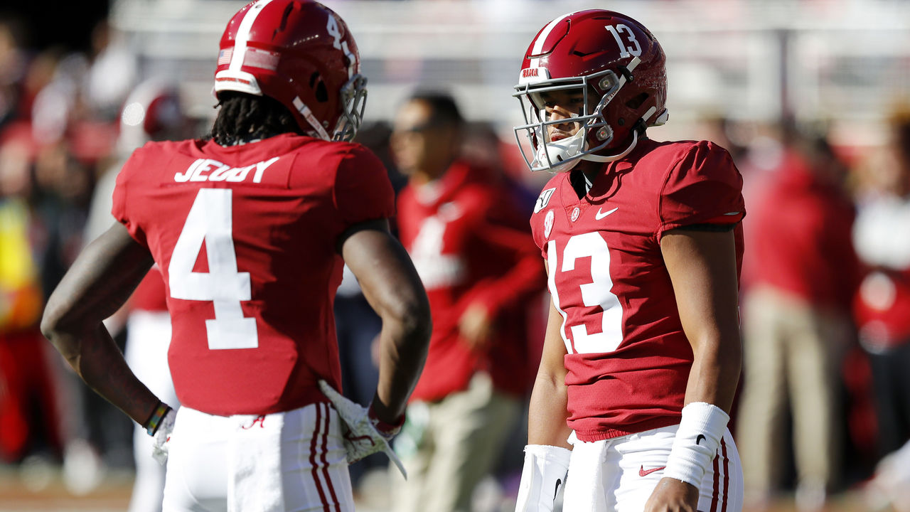
43. Alabama football (current)
Kevin C. Cox / Getty Images Sport / Getty
There's something truly special about watching highlights of a program like Alabama that's enjoyed an unprecedented run of success over the decades. The star players come and go, but the uniform never changes, and all that history in Tuscaloosa is interwoven in crimson. We love the simple striping on the helmet and pants, and a jersey free of everything but a player's name and number helps deliver the timeless aesthetic. The numbers on the helmet rock, too.
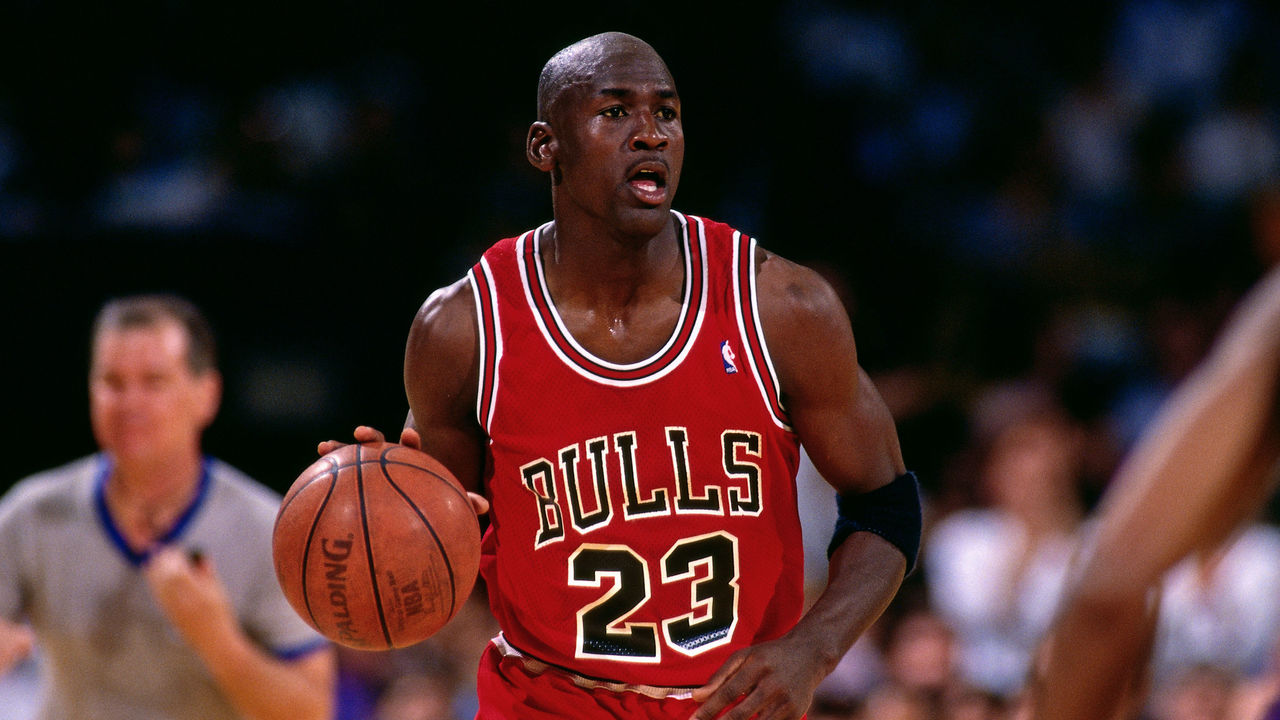
42. Chicago Bulls (current)
Andrew D. Bernstein / National Basketball Association / Getty
These uniforms haven't changed for decades, but we can all agree they're best represented by the Michael Jordan-led era of the '90s Bulls. MJ's dominance helped Chicago become one of the most famous franchises in the world, and the jerseys today are still instantly recognizable. Red and black is the only appropriate color scheme for the Bulls, and the bold wordmark across the chest will live on forever.
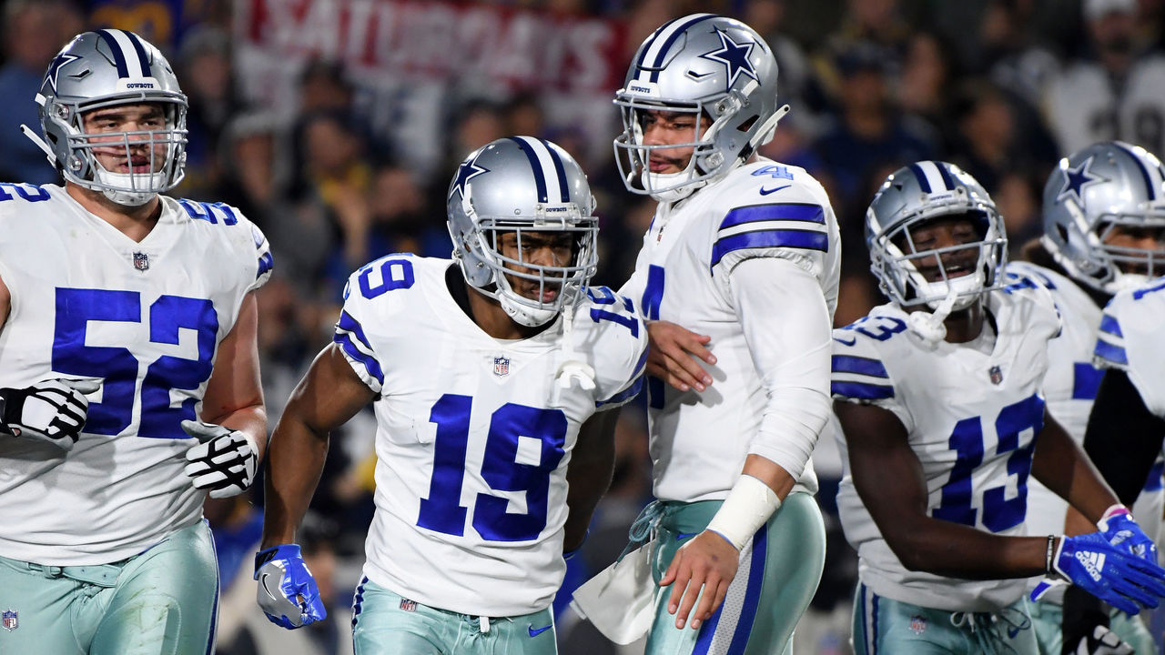
41. Dallas Cowboys (current)
Harry How / Getty Images Sport / Getty
America's Team looks so good in home whites that it hardly ever finds the need to wear a different uniform. The star-branded helmets are truly iconic, and the straightforward jerseys are flat-out gorgeous, but the silvery-blue pants not quite matching the helmets is what prevents the Cowboys from being closer to the top of our list.