Category Archives: Hockey News

Seabrook wants to disprove doubters: ‘I’m not done playing’

Brent Seabrook says he'll be ready to contribute next season and is motivated to prove it after having his 2019-20 campaign cut short by multiple surgeries.

"I feel like I'm 19 years old again trying to make the team," the Chicago Blackhawks defenseman told The Athletic's Pierre LeBrun earlier this week. "I'm skating and doing treatment and doing all these extra things here and there. Just trying to get prepared and ready, get the flexibility back - which was a battle for a while - and get the skating back, which has been great. The last two-to-three weeks I've felt really good on the ice. … It's been incredible."

Seabrook added that he has no plans to quit despite his injuries, advanced age, and declining production.

"I'm excited for training camp," he said. "I'm excited for the opportunity to get back out there and show everybody what I got. I'm not done playing hockey. I get that 35 is old in the sports world, but I don't feel old, I still feel young."

The blue-liner was limited to 32 games last season. He underwent three procedures over a six-week span beginning in late December, having his right shoulder repaired followed by both of his hips. The 15-year veteran, who played his final game of the campaign Dec. 15, tried to return for the playoffs but failed to crack Chicago's postseason roster.

Seabrook collected only four points while posting a 41.22 expected goals for percentage and a 41.53 scoring chances for rate during his abbreviated 2019-20 season.

He's spent his entire career with the Blackhawks, helping them win the Stanley Cup in 2010, 2013, and 2015. However, Seabrook's playing time has steadily declined in the years since those titles.

Season Seabrook ATOI
2015-16 22:49
2016-17 21:54
2017-18 20:12
2018-19 19:06

Seabrook has four years left on his contract at a cap hit of $6,875,000. The Blackhawks parted with two key members of their championship core this offseason, as goaltender Corey Crawford signed with the New Jersey Devils and forward Brandon Saad was traded to the Colorado Avalanche.

Copyright © 2020 Score Media Ventures Inc. All rights reserved. Certain content reproduced under license.

Sens sign Haley to 1-year contract

The Ottawa Senators have signed veteran enforcer Micheal Haley to a one-year, two-way contract, the team announced Friday.

The deal is worth $700,000 at the NHL level.

"Micheal will bring experience, leadership, and additional physicality to our organization," general manager Pierre Dorion said. "He's looking forward to serving as a mentor for our young players."

Haley posted one goal in 22 games with the New York Rangers last season.

The 34-year-old has appeared in 270 career NHL contests. He's collected 32 points and 687 penalty minutes in stints with the New York Islanders, San Jose Sharks, Florida Panthers, and Rangers.

Copyright © 2020 Score Media Ventures Inc. All rights reserved. Certain content reproduced under license.

NHL logo rankings: 30-21

50-41 | 40-31 | 20-11 | 10-1

Welcome to the theScore's NHL logo countdown. This list examines logos that date back to the inception of the Original Six and includes the main emblem for all 32 current teams, 11 clubs that moved or changed their name, and seven whose logo has undergone a significant redesign. Only primary ones were considered.

The five-part series concludes with the top 10 on Friday. Let's continue with Nos. 30-21.

30. Winnipeg Jets

When the Jets returned to Winnipeg, the team unveiled a brand new logo using the original Jets' colors. The emblem pays homage to the Royal Canadian Air Force by using its logo as inspiration with a jet plane placed over a red maple leaf. This is about as Canadian as it gets.

29. Ottawa Senators

Senators fans rejoiced when the club announced they're reverting back to their original 2D design this offseason, and for good reason. Ottawa's original logo is a gigantic upgrade over the in-your-face 3D Senator caricature the team used for so long. Simplifying a logo is almost never a bad thing.

28. Buffalo Sabres (1996-2006)

The Sabres' complete uniform overhaul in the '90s was certainly bold, but the red and black buffalo head was so menacing that it worked. The design lasted only a decade, but it's forever linked to Dominik Hasek's peak run of excellence and a surprise trip to the 1999 Stanley Cup Final. Above all else, at least it's not the "Buffaslug" - the monstrosity of a primary logo that followed until Buffalo rightly returned to its roots in 2010.

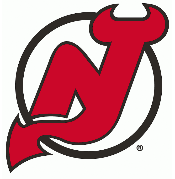
27. New Jersey Devils

It's not immediately evident at first glance, but the Devils' incorporation of the "N" and "J" morphing into the image of a devil's tail and horns is fantastic. It's hard not to think of the glory days of Martin Brodeur and Co. when looking at this logo, which has gone mostly unchanged since its introduction in 1982.

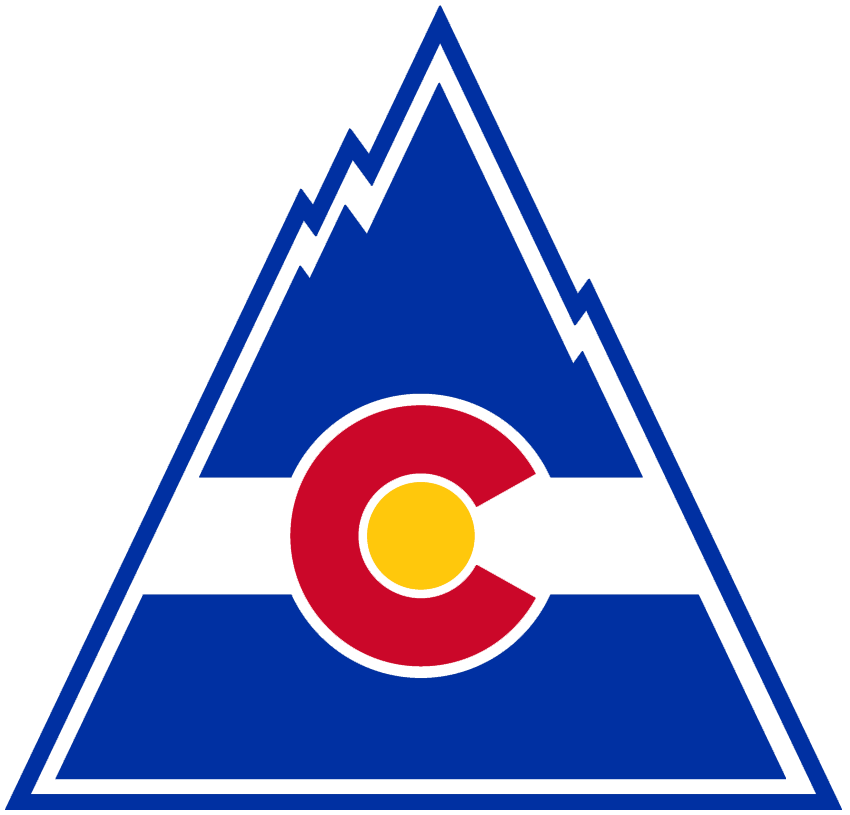
26. Colorado Rockies

The ill-fated Rockies lasted just six seasons, but their logo lives on today. The Colorado state flag "C" used in this emblem can be seen on the shoulder patch of the Avalanche's jerseys, albeit with different colors. We love this '70s color scheme, and the logo might be more memorable had the Rockies enjoyed any sort of success during their brief tenure.

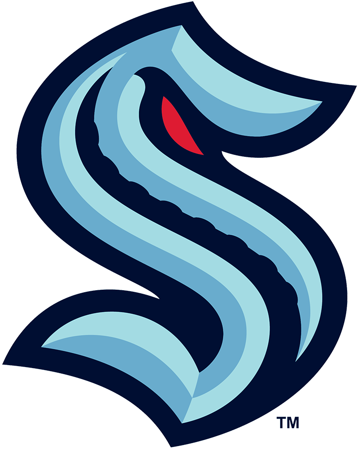
25. Seattle Kraken

The NHL's newest franchise knocked its logo selection out of the park. While we were disappointed to see green left out of the color scheme, the double blue and red works. The tentacle outline on the "S" is a nice touch, while the red eye adds to the intimidation of this sea creature.

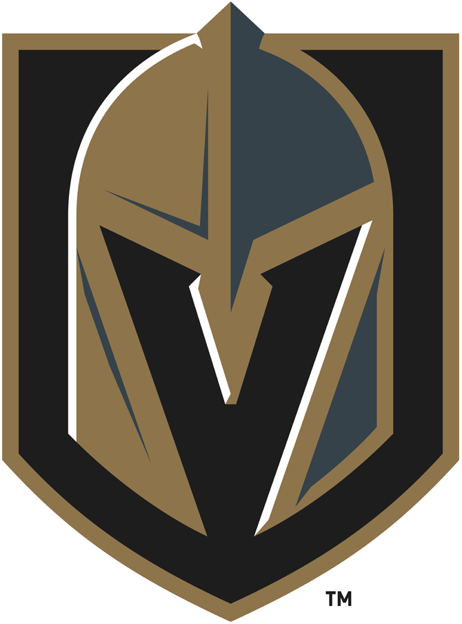
24. Vegas Golden Knights

Vegas' logo was met with general approval upon its unveiling in 2017. The possibilities were endless for the team name and logo in Sin City, but ultimately the organization went with a safer choice. The color is a nod to Nevada being the highest gold-producing state in the U.S.

23. Philadelphia Flyers

The Flyers' primary logo has gone completely untouched since the team's inception in 1967, and for good reason. It's just perfect: The slanted "P" with an orange dot in the middle to signify a puck, and the wings on the side to represent speed - hence the "Flyers." It's hard to imagine this logo ever changing.

22. Florida Panthers (1993-2016)

We agreed that the old Panthers logo is better than their current one, which came in at No. 37 on this list. While a bit cartoony, the original was much more fierce and intimidating.

21. San Jose Sharks

Logos don't get more unique than a vicious-looking shark demolishing a hockey stick with its teeth. The menacing graphic is one of the league's most distinct, but the incorporation of the beautiful teal color is what puts the cherry on top here.

Copyright © 2020 Score Media Ventures Inc. All rights reserved. Certain content reproduced under license.
NHL logo rankings: 10-1

50-41 | 40-31 | 30-21 | 20-11

Welcome to the theScore's NHL logo countdown. This list examines logos that date back to the inception of the Original Six and includes the main emblem for all 32 current teams, 11 clubs that moved or changed their name, and seven whose logo has undergone a significant redesign. Only the primary ones were considered.

Here are the top 10 logos.

10. Minnesota North Stars

So simple yet so effective. The unique blend of green and yellow is synonymous with the North Stars, and the sharp design still holds up decades after the club's relocation to Dallas, who ironically could use a new look.

9. St. Louis Blues

If a team's logo stays roughly the same for over 50 years, it means they did something right. Aside from a few wordmarks and color tweaks, the famous "Blue note" has mostly stayed the same since the team's inception in 1967. The logo perfectly captures the jazz and blues scene St. Louis is known for.

8. Montreal Canadiens

One of the oldest and most recognizable logos in all of pro sports, the Canadiens' crest is still one of the best in the league. The red, white, and blue along with the 'C' and 'H' are so simple but work so well. The logo hasn't changed much since its introduction in 1917, and rightly so.

7. Boston Bruins

The Bruins are the NHL's oldest American team, and while they didn't introduce the spoked B until 25 years into their history, it's become iconic ever since. This logo has only undergone slight changes over the years, and for a good reason. It's a simple yet eye-catching look.

6. Quebec Nordiques

It's not the most thrilling design, but we adore the classic look Quebec rocked before the franchise moved to Denver. The lowercase "N" is extremely '70s, but the fact it forms an igloo is a perfect touch. We always appreciate incorporating a stick and a puck, and the dynamic shades of red and blue tie everything together perfectly. Surely we aren't alone in hoping to see this logo on the ice again one day.

5. Buffalo Sabres

At last, the Sabres have it right again. After multiple redesigns from their original logo, Buffalo finally brought back its first crest this offseason with the proper shade of royal blue - rather than the navy that's diminished the iconic look's luster over recent years. Let's hope this beauty never disappears again.

4. Mighty Ducks of Anaheim

This logo is a cult classic for an entire generation of hockey fans. It would likely be criticized if it were released today without a beloved movie franchise attached to it, but the Mighty Ducks' crest is one of the most admired in the sport more than 10 years since Anaheim moved on to its current drab logo and uniform combination.

3. Toronto Maple Leafs

The Maple Leafs logo has varied over the years, but switching to this iconic masterpiece - similar to what the club wore from 1938-63 - for the 2016-17 campaign was definitely the right move. Former team owner Conn Smythe originally gave the franchise the Maple Leafs logo in 1927 to honor the badge worn by Canadian soldiers in the First World War.

2. Detroit Red Wings

The Red Wings' classic look is one of the greatest in all of sports. Not only is the logo a masterpiece aesthetically, but the wheeled wing perfectly represents the heart of the Motor City. The timeless design has remained virtually the same since the team adopted its name in 1932, which is a testament to how connected it is to the history of the city and the sport.

1. Hartford Whalers

This logo is so simple yet complex at the same time. The green "W" for Whalers and the blue whale's tail are obvious, but it may require a second glance to realize the negative space between those two makes up the "H" in Hartford. Even though the Whalers relocated to Carolina in 1997, it remains the greatest NHL logo of all time and one of the best in sports history.

Copyright © 2020 Score Media Ventures Inc. All rights reserved. Certain content reproduced under license.
Report: Idea of NHL teams playing in home rinks gaining steam

It appears short-term hubs may not be used for the 2020-21 season after all.

The idea of NHL teams playing games in their own arenas is gaining steam for the upcoming campaign, sources told TSN's Frank Seravalli.

This contradicts commissioner Gary Bettman's comments Tuesday in which he said the league was considering sending teams to a hub for 10-12 days to play games before going back home for a week. Although that idea still remains a possibility, it appears it wasn't overly popular during Thursday's Board of Governors meetings.

The significant price of operating bubbles and the potential loss of revenue with neutral-site games are among the leading reasons why the league prefers teams to travel from city to city to play, like MLB and the NFL have done. The NHL reportedly spent an estimated $75 million to $90 million on the playoff bubbles in Toronto and Edmonton.

The league is also apparently considering two-to-three game series against each opponent - similar to baseball - in order to reduce travel.

Teams would be permitted to have fans in their arenas in limited capacities - like the NFL has done - in certain regions that allow it.

The NHL is still targeting Jan. 1 as a start date and hopes it can finish the playoffs by mid-July before the Olympics begin. That timeline would seemingly provide four-to-five months for a regular season and two-to-three months for the postseason. A 48-game campaign is reportedly considered the minimum, but models of 62, 60, and 56 contests apparently exist.

During the lockout-shortened 2012-13 campaign, the league began its 48-game season Jan. 19 and had the Cup awarded June 24.

Copyright © 2020 Score Media Ventures Inc. All rights reserved. Certain content reproduced under license.
Sharks say downtown projects could force team out of San Jose

The San Jose Sharks are calling on their fans to help them prevent potential development plans from pushing the club out of its home arena and the city itself.

"For more than a year, we have been sharing our concerns with you regarding the proposed, massive development projects within the Diridon area of downtown San Jose, which surrounds SAP Center," the Sharks wrote Thursday in an email to fans.

"For the past several years, we have been sharing those same concerns with city of San Jose officials and Google. Unfortunately, those discussions have yielded limited results, and the planners of these projects appear intent on moving forward in a manner that could force the Sharks out of San Jose."

The city of San Jose is looking to redevelop about 250 acres of land in the Diridon neighborhood. The proposal overlaps with Google's "Downtown West" project, which would involve up to 65 new buildings in the 84-acre Diridon Station area.

The Sharks are concerned about the impact of those plans on parking availability around SAP Center, as well as fans' ability to access the arena both during and after construction.

The team is asking fans to submit feedback on the plans to the city both online and at a community meeting in early December. The Sharks also called on supporters to raise concerns about the project with local lawmakers.

"We haven't really gotten where we needed to go with the city," Sharks president Jonathan Becher told reporters Thursday, according to The Athletic's Kevin Kurz.

He added: "We're frankly freaked out on behalf of our fans. ... My sense is everyone's hoping that someone will figure this out, the city will eventually figure this out. But to use an old phrase that's used often, hope isn't a strategy."

The Sharks' lease at SAP Center runs through at least 2025, and they have the option to renew it until 2040.

Copyright © 2020 Score Media Ventures Inc. All rights reserved. Certain content reproduced under license.
Hurricanes GM hopes to extend Hamilton before season

Though the two sides have yet to begin contract negotiations, Carolina Hurricanes general manager Don Waddell hopes to lock up star defenseman Dougie Hamilton to a long-term deal in the near future.

"We're getting close to talking about it (contract extension)," Waddell said Thursday, according to NHL.com's Tom Gulitti.

He added: "He is a UFA at the end of the year, so we'd like to get that one done sooner than later. That one, you would have doubts if you play out the season, so it makes sense to try to get something done before the start of the season."

The 27-year-old has one season remaining on his current deal, which he signed with the Calgary Flames in 2015. The Hurricanes acquired the defenseman prior to the 2018-19 campaign.

Hamilton was among the Norris Trophy front-runners in 2019-20 before he fractured his fibula in January, sidelining him for the remainder of the regular season. He amassed 14 goals and 26 assists in 47 games.

However, Waddell knows it will be increasingly difficult to sign Hamilton to a lucrative long-term deal due to the financial implications of the ongoing coronavirus pandemic.

"You've got a flat cap for the next two years, we know that," Waddell said. "We also know that the market's changed. I'm not saying we're not going to do a long-term deal, but the long-term deals, if you look at free agency, you've only got a few guys that got more than three years in the whole market. ... So I think the market has changed and it should change because of the situation we're all-in."

Hamilton is a key part of a strong defensive group in Carolina. The team already has Jaccob Slavin, Jake Gardiner, Brady Skjei, and Brett Pesce signed for at least the next three seasons.

Copyright © 2020 Score Media Ventures Inc. All rights reserved. Certain content reproduced under license.