Category Archives: Hockey News

Red Wings’ Ryan: Buyout from Senators came as ‘complete shock’

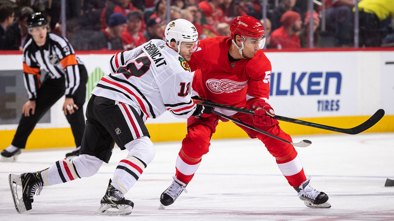
Detroit Red Wings forward Bobby Ryan didn't expect to find himself in a new city for the 2020-21 campaign.

The veteran winger had the final two years of his contract with the Ottawa Senators bought out in September after spending seven seasons with the club.

"It was about a minute conversation. There’s really not much to say," Ryan said, according to The Athletic's Craig Custance. "What do you say, really? I said, 'OK, thank you, good luck' and that’s it. It came as a complete shock … It was not the call I expected on that Friday morning for sure."

Ryan won the Bill Masterton Trophy in 2020 after publicly sharing his battle with alcohol abuse. The former first-round draft pick took three months off during the season to seek treatment and scored a hat trick upon his return to Ottawa in February.

The 33-year-old says he's forever grateful for the love and support he received from the city despite his abrupt ending with the organization.

"I’ve always liked the people in Ottawa," Ryan said, according to Custance. "I won’t say I ever truly fell in love with the city part of it. The people in the community are just incredible. I had so many ups and downs there. So many highs, like the playoffs. And lows, slumps, and last year. They always embraced me ... you never got the sense that they’d given up on you."

Ryan inked a one-year, $1-million deal with the rebuilding Red Wings in October. The 6-foot-2 right-handed shooter scored 15 goals and 42 points through 78 games during the 2018-19 season and now wants to prove he's still got plenty left in the tank.

"I knew that I needed to prove there is still some high-end hockey in me. I didn’t want to go somewhere and immediately be a third- or fourth-line guy. I still think I can play in the top six to nine."

The New Jersey native has amassed 254 goals and 555 points over 833 NHL contests.

Copyright © 2020 Score Media Ventures Inc. All rights reserved. Certain content reproduced under license.


NHL logo rankings: 20-11

50-41 | 40-31 | 30-21 | 10-1 (Nov. 13)

Welcome to theScore's NHL logo countdown. This list examines logos that date back to the inception of the Original Six, and it includes the main emblem for all 32 current teams, 11 clubs that moved or went through a name change, and seven logos that have undergone a significant redesign. Only primary ones were considered.

The five-part series concludes with the top 10 on Friday. Let's continue with Nos. 20-11.

20. Phoenix Coyotes

Opinions on this logo are often split. Some think it's too busy, while others love the creativity. The Kachina design is unique, and it ties the team nicely to the Arizona area. However, the emblem seems to be more popular now after making its return on the Coyotes' throwback jerseys than during the late '90s and early 2000s, when it was the club's primary logo. Don't be surprised if it becomes the primary again in due time.

19. Calgary Flames

What else could you really ask for other than a flaming "C" in Calgary? The club has stuck with this base design through slightly different iterations since its inception, and the recent simplification of the logo - removing a black outline - makes it look flawless on one of the sport's best uniform sets.

18. Vancouver Canucks (1978-1992)

The Canucks' flying-skate logo is the franchise's best. It's a bold, intricate, and cleanly executed concept that still holds up as one of the league's top emblems. The clash of black, yellow, and orange is unique and works well with the design, as opposed to the first time the club applied the flashy color scheme.

17. New York Rangers

The Rangers' shield-style logo is among the best of its kind. The team needed a few tries before settling on this font and design, and it's been in use since the '70s. The logo is simple with bold colors, but complex doesn't always mean good.

16. Pittsburgh Penguins

A golden triangle to represent the downtown Pittsburgh area and a fierce-looking Penguin on skates is an iconic look for the franchise that's donned this crest for all five of its championships. Classic, simple, and effective.

15. Edmonton Oilers

We love a unique wordmark, and the Oilers' droopy font has stood the test of time. Edmonton has never shifted from the base design of this logo - save for one ultra-bold alternate jersey - and we don't see a reason why the club ever would.

14. Winnipeg Jets (1979-90)

Many were calling for the Jets to bring back this sublime design when the team returned to Winnipeg, and rightfully so. The colors are bold, the letters pop out, and it's a delight for the eyes. The "J" being in the shape of a hockey stick is also a nice touch on one of the most timeless logos in NHL history.

13. Colorado Avalanche

There's a reason this logo has gone untouched throughout the Avalanche's existence. The puck-led avalanche around the mountain perfectly forms the letter "A," and the swoop of snow also creates a subtle "C." The logo connects nicely to Denver's roots, too.

12. Minnesota Wild

How long did it take you to learn that this picturesque forest landscape also forms the shape of a wild animal? The path is the mouth, the shooting star (an ode to the Minnesota North Stars) is an eye, and the sun is an ear. This logo gets bonus points for uniqueness and creativity.

11. Chicago Blackhawks

The Blackhawks' classic logo has undergone very minor changes over the franchise's near century-long existence. An artistic side profile of Black Hawk, a Native American of the Sauk nation and a prominent historical figure in Illinois, has been central to Chicago's look since the beginning. It's one of the most colorful and detailed logos in all of sports.

Copyright © 2020 Score Media Ventures Inc. All rights reserved. Certain content reproduced under license.

3 options for NHL’s temporary realignment

After commissioner Gary Bettman announced Tuesday that the NHL is considering a temporary realignment for the upcoming season, theScore decided to create three realignment options the league could explore.

With Canada's 14-day quarantine rules still in effect (despite an ongoing pilot project), it's not surprising that Bettman hinted an all-Canadian division may be inevitable in 2020-21. But how would that affect the rest of the NHL?

There are a few important things to keep in mind here. Bettman specifically said having teams travel "from Florida to California may not make sense," so we've eliminated inter-conference regular-season games. These realignment proposals are designed to align time zones and reduce travel as much as possible - even if teams are playing in short-term hubs for 10-12 days at a time, as Bettman revealed.

For the purposes of this exercise, we assumed the league will stage a 48-game regular season, which is reportedly the shortest campaign it's considering. Bettman also said he hopes to have the playoffs finished before July, so anything more than 48 games seems challenging with a Jan. 1 target start date. The NHL ran a 48-game season during the lockout-shortened 2012-13 campaign, so there's familiarity.

Here are our three realignment options:

4 divisions

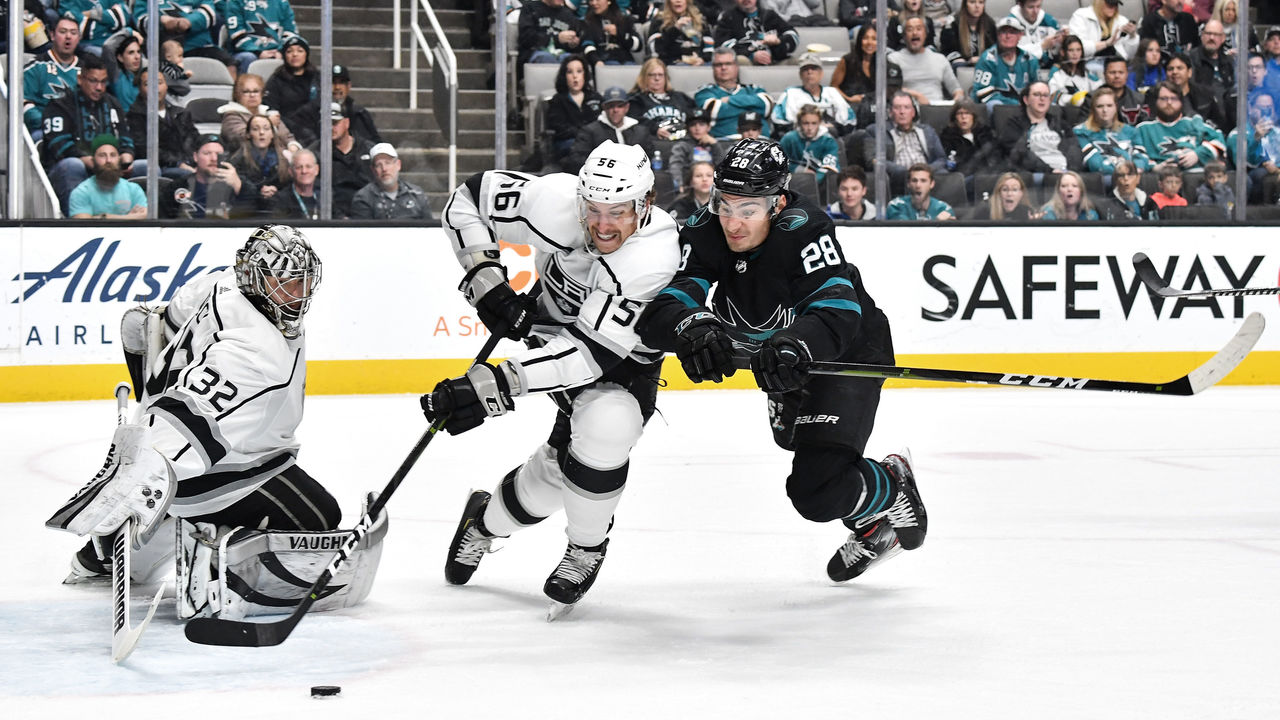
Brandon Magnus / National Hockey League / Getty
East South Central West Canada
Boston Carolina Anaheim Calgary
Buffalo Chicago Arizona Edmonton
New Jersey Columbus Colorado Montreal
NY Islanders Detroit Dallas Ottawa
NY Rangers Florida Los Angeles Toronto
Philadelphia St. Louis Minnesota Vancouver
Pittsburgh Nashville San Jose Winnipeg
Washington Tampa Bay Vegas
  • U.S. teams play each divisional opponent six-to-seven times. The top four teams in each division make the playoffs.
  • Canadian teams play each divisional opponent eight times. The top four teams make the playoffs.

The East and West divisions are nicely split geographically, but the South Central is a bit of a mishmash. It features three teams on Central Time - the Blackhawks, Predators, and Blues - and five on Eastern Time.

The only competitive imbalance comes in the West division, where at least one of the Ducks, Coyotes, Kings, Wild, and Sharks would make the playoffs. All five of those clubs finished in the bottom third of the league in points percentage last season.

5 divisions

Dave Reginek / National Hockey League / Getty
Atlantic Metro Central Pacific Canada
Boston New Jersey Chicago Anaheim Calgary
Buffalo NY Islanders Dallas Arizona Edmonton
Carolina NY Rangers Detroit Colorado Montreal
Columbus Pittsburgh Minnesota Los Angeles Ottawa
Florida Philadelphia Nashville San Jose Toronto
Tampa Bay Washington St. Louis Vegas Vancouver
Winnipeg
  • U.S. teams play each divisional opponent 9-10 times. The top three teams in each division make the playoffs.
  • Canadian teams play each divisional opponent eight times. The top four teams make the playoffs.

This configuration offers a far better geographic split than the four-division option. The Red Wings draw the short straw as the only team in the Central Division on Eastern Time, with the other five using Central Time. Detroit could easily switch with the Blue Jackets, though, as both teams were in the Western Conference before the league realigned for the 2013-14 campaign.

The most glaring competitive imbalance once again comes in the western-most division - the Pacific. The Avalanche and Golden Knights are elite, but the other four teams are mediocre at best.

3 conferences, 8 divisions

Patrick Smith / Getty Images Sport / Getty

Eastern Conference

Northeast Metro Southeast
Buffalo New Jersey Carolina
Boston NY Islanders Columbus
Pittsburgh NY Rangers Florida
Washington Philadelphia Tampa Bay
  • Teams play divisional opponents eight times each and out-of-division opponents three times each. Division winners clinch playoff spots, while the remaining top three teams in the conference earn wild-card spots.

Western Conference

Central Mid-West Pacific
Chicago Arizona Anaheim
Detroit Colorado Los Angeles
Nashville Dallas San Jose
St. Louis Minnesota Vegas
  • Teams play divisional opponents eight times each and out-of-division opponents three times each. Division winners clinch playoff spots, while the remaining top three teams in the conference earn wild-card spots.

Canadian Conference

Canada East Canada West
Montreal Calgary
Ottawa Edmonton
Toronto Vancouver
Winnipeg
  • Canada East teams play divisional opponents 12 times each and Canada West clubs six times each.
  • Canada West teams play divisional opponents 10 times each and Canada East clubs six times each.
  • Division winners clinch playoff spots, while the remaining top two teams in the conference earn wild-card spots.

An eight-division system works for the NFL, so why not use it in the NHL for a season? This would seemingly be the fairest option, as it features the most non-divisional games and doesn't favor weak divisions as heavily as the other proposals.

But more non-divisional games could mean more travel, and that's something the NHL likely doesn't want. This specific alignment would also be even more unfair for the Red Wings: Detroit would be the only team playing opponents more than two time zones away.

Copyright © 2020 Score Media Ventures Inc. All rights reserved. Certain content reproduced under license.
NHL logo rankings: 40-31

50-41 | 30-21 | 20-11 (Nov. 12) | 10-1 (Nov. 13)

Welcome to the theScore's NHL logo countdown. This list examines logos that date back to the inception of the Original Six and includes the main emblem for all 32 current teams, 11 clubs that moved or changed their name, and seven whose logo has undergone a significant redesign. Only primary ones were considered.

The five-part series concludes with the top 10 on Friday. Let's continue with Nos. 40-31.

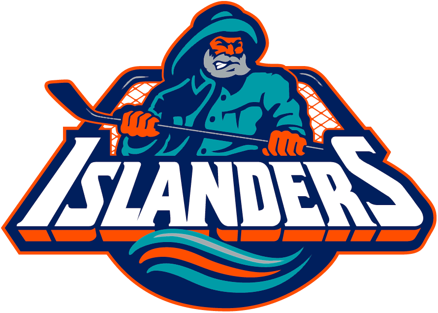
40. New York Islanders (1995-97)

There's no in-between for the Islanders' "Highliner" era: You're either fully on board with the nostalgia or you can't shake the feeling of staring at a box of fish sticks. Regardless of where you stand, the incorporation of teal deserves props for at least being creative.

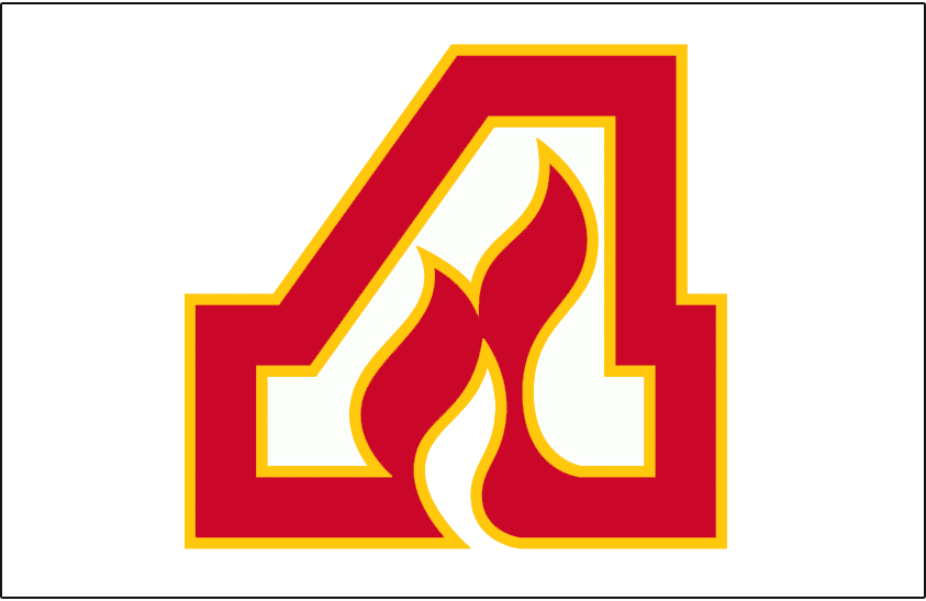
39. Atlanta Flames

For whatever reason, Atlanta's flaming "A" doesn't quite work as well as Calgary's flaming "C." The colors definitely pop, but the design lacks inspiration and doesn't hold up when it's not crested on a jersey.

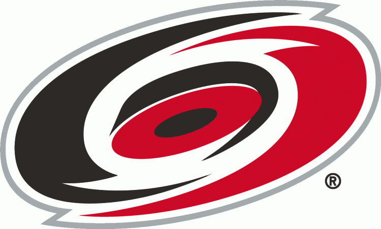
38. Carolina Hurricanes

Realistically, how many ways can a hurricane be artistically depicted? Carolina would likely tell you that options are limited, as the club has rocked this underwhelming swirly design as its primary crest since relocating from Hartford in the late '90s.

37. Florida Panthers

The Panthers downgraded when they switched to this logo for the 2016-17 season. The old one was much more intimidating and ferocious.

36. Arizona Coyotes

The desert colors are slick, but the logo itself is literally just a Coyote head. For an organization that used to own one of the most artistic and unique looks in hockey, the Coyotes' modern crest is very dull.

35. Nashville Predators

There are all sorts of animal predators to choose from, so why a saber-toothed tiger? Apparently, a fang and foreleg bone of one of these prehistoric beasts was found in a cave just below the entrance of Nashville's old First American Center 26 years before the team's unveiling in September 1997. The logo is certainly fierce-looking, but it's somewhat lacking in creativity.

34. Atlanta Thrashers

The brown thrasher is the state bird of Georgia and was the inspiration behind Atlanta's team name and logo. The bird is described as aggressive and defensive, an identity the Thrashers surely hoped to replicate.

33. New York Islanders

The Islanders' original logo is easily better than the aforementioned Highliner one. The map of Nassau and Suffolk counties is a nice touch behind the New York-sized "NY," and incorporating a stick and puck is always a nice touch.

32. Vancouver Canucks

The orca breaching out of the water is a tribute to British Columbia's West Coast heritage, and presenting it as a "C" ties things together very nicely. The contrasting shades of blue also work well, and while it's not the best logo the organization has dawned, the Canucks don't have to worry about rebranding for the foreseeable future.

31. Los Angeles Kings (1967-75)

The Kings seem unlikely to shift away from their black and silver color scheme anytime soon, but we love the purple and gold. It's far more exciting and unique. This team logo, which never appeared on the front of a jersey, ranks 10 spots higher than Los Angeles' current one. Perhaps it will return in an alternate uniform someday.

Copyright © 2020 Score Media Ventures Inc. All rights reserved. Certain content reproduced under license.

Cassidy: Bruins ‘full steam ahead’ with Rask for next season

The Boston Bruins are "full steam ahead" with netminder Tuukka Rask for the upcoming campaign, according to head coach Bruce Cassidy.

"I think everything that happened in the bubble has been addressed, dealt with," Cassidy said Wednesday, according to NHL.com's Amalie Benjamin. "We're moving on, getting ready to win next year. That includes our goaltender."

Rask opted out of the league's return in August following Game 2 against the Carolina Hurricanes to tend to a family emergency. The Finnish goaltender received support from the organization and his teammates after making the decision.

Cassidy said Rask's absence affected the team mentally before the Tampa Bay Lightning eliminated the Bruins in five games. The 55-year-old bench boss believes the 2020 Vezina Trophy finalist is excited to get back and compete.

"... I think he just wants to get back in the net and play hockey and play well and give us a chance to win," Cassidy said.

"Probably nobody more excited on our team to (be) getting back in there," he added. "I would assume that Tuukka would sort of say 'hey, I'm still the goalie I was last year and I'm ready to go. Family's good, I'm good. Everyone's in a good place. Let's play hockey.'"

Rask is entering the final year of his current deal and will become an unrestricted free agent after the season. The 33-year-old has spent all 13 campaigns of his career with the Bruins, and Rask said in October he wouldn't want to play anywhere else.

Copyright © 2020 Score Media Ventures Inc. All rights reserved. Certain content reproduced under license.