Whenever an NHL franchise unveils a fresh jersey, logo, or full getup, an avalanche of analysis follows. Practically everyone serves up a take, from hardcore fans to casuals. That's passion and what fandom's all about.
People who make a living in the sports branding space have strong opinions, too.
Ahead of Monday's Winter Classic in Seattle, theScore asked two sports design gurus to rate and review six of the latest unveilings across the NHL.
Bill Frederick is creative director for Fanbrandz, a sports branding agency. Todd Radom, co-author of "Fabric of the Game: The Stories Behind the NHL's Names, Logos, and Uniforms," is a freelance designer and branding expert.
Golden Knights (Winter Classic)
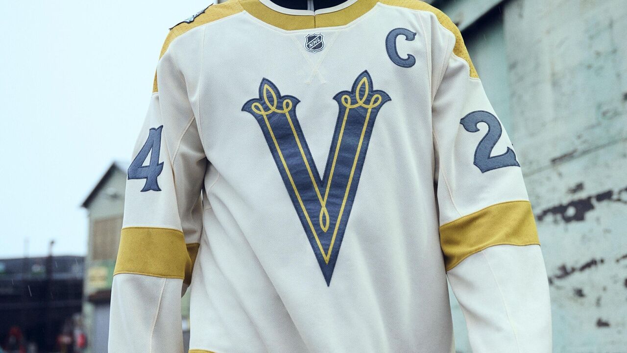
How does a franchise based in the Mojave Desert that debuted in 2017 create a sharp look suitable for the wintery, nostalgia-soaked Winter Classic?
By developing a story based on what a local NHL team would have looked like in a bygone era, apparently. Vegas' Winter Classic aesthetic is heavy on the Wild West of the early 1900s: cowboy hats, horses, and gambling in a dark saloon.
The end product is a fairly straightforward white, green, and gold jersey. It's regal and leathery. The stylish crest - a large "V" with curly accents - is the draw.
"Top to bottom, this thing is huge," Radom said of the crest. "But it fills the space nicely and it's going to look great on broadcasts. It's very wearable."
"The Knights are using restraint here," Frederick added. "They certainly could have put the team name in front of or arched across the 'V.' I'm sure it was a real option. They must have just come back from that meeting and said, 'Let's just do the 'V,' we're good with that.' And that was definitely a good choice."
Radom envisions this faux-back look being a quick mover on retail racks.
"I can see this being very popular," he said. "I was struck a couple of years ago while I was in Vegas with how deeply invested their fans are, seeing as it's not a traditional hockey market. I remember getting into an Uber and there's Knights stuff just all over the vehicle, inside and out. So, I would imagine the market is probably as saturated as it could be with that core look, given their success on and off the ice so far. Adding this jersey to the stable is brilliant."
Seven stars mark the jersey's collar, one for every Vegas season to date.
Frederick's rating: 8.5 out of 10
Radom's rating: 8 out of 10
Kraken (Winter Classic)
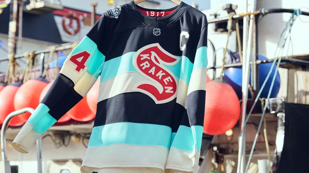
Unlike Vegas, Seattle has an NHL past, and this look (which is the subject of a trademark infringement lawsuit) is a direct nod to the Seattle Metropolitans, the first American team to win the Stanley Cup back in 1917.
The felt crest is quite similar to the championship squad's (though "Kraken" snakes the inside of the red "S" logo, not "Seattle"). And it jumps off the old-school barber-pole stripe design thanks to two colors unique to the Kraken brand (midnight blue and ice blue) and a classic off-white called vintage cream.
Both Frederick and Radom noted how this jersey strikes a wonderful balance. It's not overly vintage or overly modern. It's quirky but not too quirky or weird.
"The letterforms in the 'S' just make it look fantastic," Frederick said. "It looks just like an old sweater you might see at the Hockey Hall of Fame in Toronto. It looks like it got sewn on by somebody who was making jerseys back then."
Added Radom: "I love the color scheme of the team to begin with. And I love the fact that this combines Seattle's NHL history - which has this gigantic gap between teams - in a seamless way. It's a celebratory look. It's attractive. I would wear the hell out of it if I was walking around Seattle. It's awesome."
Frederick's rating: 9/10
Radom's rating: 9.5/10
Oilers and Flames (Heritage Classic)
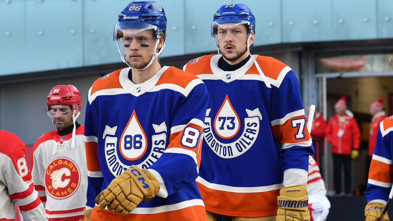
These looks, rocked outdoors Oct. 29 in Edmonton, can be discussed together. They're both 1950s throwbacks, and the Oilers won the Battle of Alberta on the ice (5-2) and in the design studio.
The Oilers' digs feature a slick and unique oil drop, tasteful banner lettering, along with player numbers on the left sleeve, and the event logo on the right shoulder. The brown pants and gloves complement the jersey's colors very well.
"It looks vintage. It doesn't look forced," Radom said. "My benchmark with throwbacks is always something like this: Does this look like it was done on a computer in 2022, or whatever, trying to look like 1946, or does this look organic? This Oilers jersey succeeds because it looks very organic and real."
Frederick appreciates how player numbers are also set inside the oil drop. "That's a really nice touch," he said of a design choice rare to hockey jerseys.
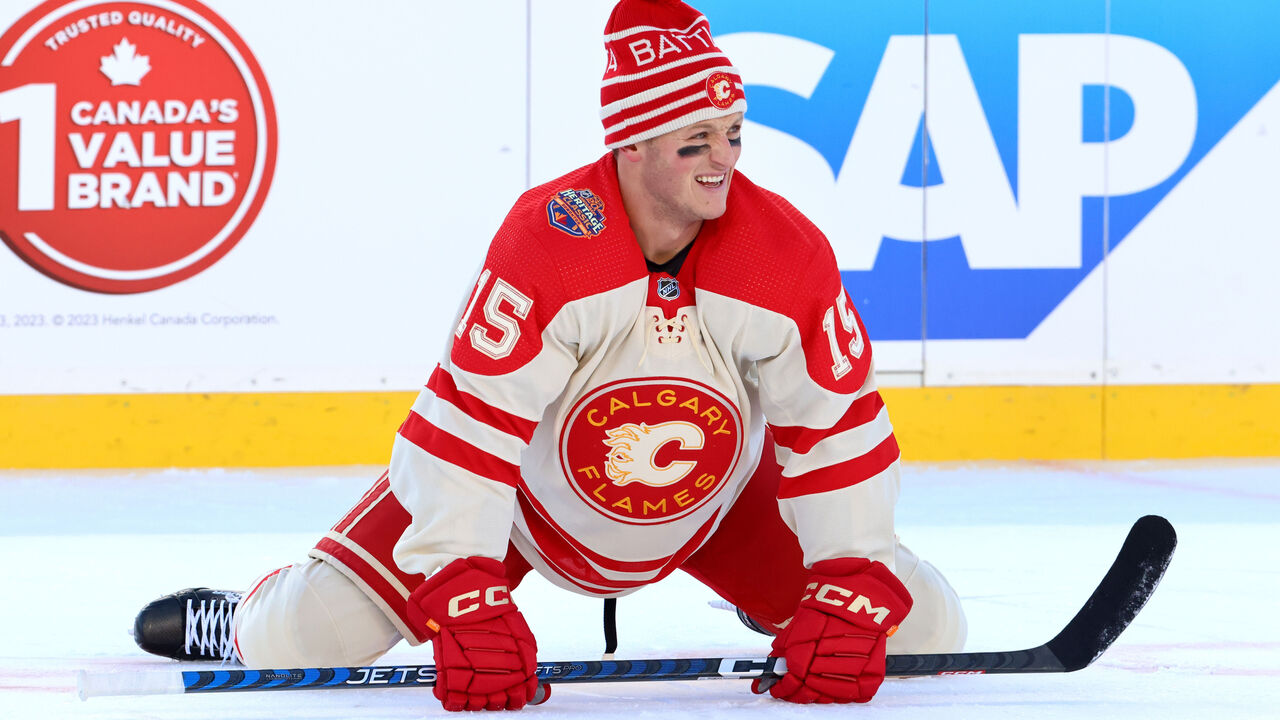
The Flames' look is, in a word, standard. Basic vintage jersey stuff. Sharp yet uninventive. The hockey-lace neck tie is a microcosm: simple, clean, classic.
"If you're trying to convey the idea of vintage hockey, there's nothing better than the laces. It's a crutch to some degree - a stereotype that's often leaned into. But sometimes vanilla ice cream tastes really good, right?" Radom said.
Neither expert hates Calgary's look - or loves it.
The crest lacks nuance, Radom noted. The lettering is "kind of cliched and somewhat expected." Some black outlining within the crest would add a bit of contrast and give the team name and flaming "C" logo a bit of separation.
"When you eliminate black from it, which has been part of their color scheme along the way, you lose a little something," he said. "If you're trying to look vintage, you're probably not going to have three colors. You're going to have two. That's the classic, Original Six look. But, in this case, it's problematic."
Frederick agreed.
"I also wonder if the outline on the 'C' logo gets a little busy in there," he said. "On the back end of it, around the flame part, it's really all clogging up."
Frederick's rating: 7.5/10 for Oilers; 8/10 for Flames jersey, 6/10 for crest
Radom's rating: 8/10 for Oilers; 6.5/10 for Flames
Rangers (new third)
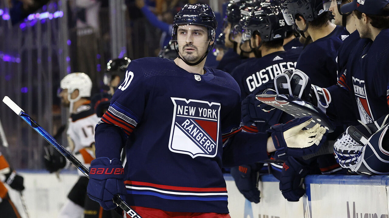
Officially called the New York City Nights third, this jersey is in many ways a typical Original Six alternative. The main color (navy blue) doesn't shock the system. The crest is familiar (albeit very large). There are few elements overall.
"They're not doing anything particularly adventurous. Which is OK. It gives the team another tool for the toolbox over the course of a long season," Radom said of the Rangers, who'll show off their new toy 10 times in 2023-24.
The red, white, and blue striping on the waist and sleeves was incorporated to represent the hustle of the Big Apple, particularly the lights of streaking traffic and Madison Square Garden. But both experts see holes in the city-nights theme.
"The waist striping is absolutely right on brand, but I'm surprised they went with those thin stripes on the arms," Frederick said. He called the execution of the theme a "stretch." Radom wondered if the designers simply fell in love with the theme, then failed to reconsider when the execution was meh. "That's an instance where maybe the tail is wagging the dog," he said.
All that stated, there's a neat Easter egg hiding on the jersey's back collar: "BLUESHIRTS" is laid out on an NYC subway tile pattern. Thoughtful detail.
Frederick's rating: 7/10
Radom's rating: 7/10
Hurricanes (Whalers Night)
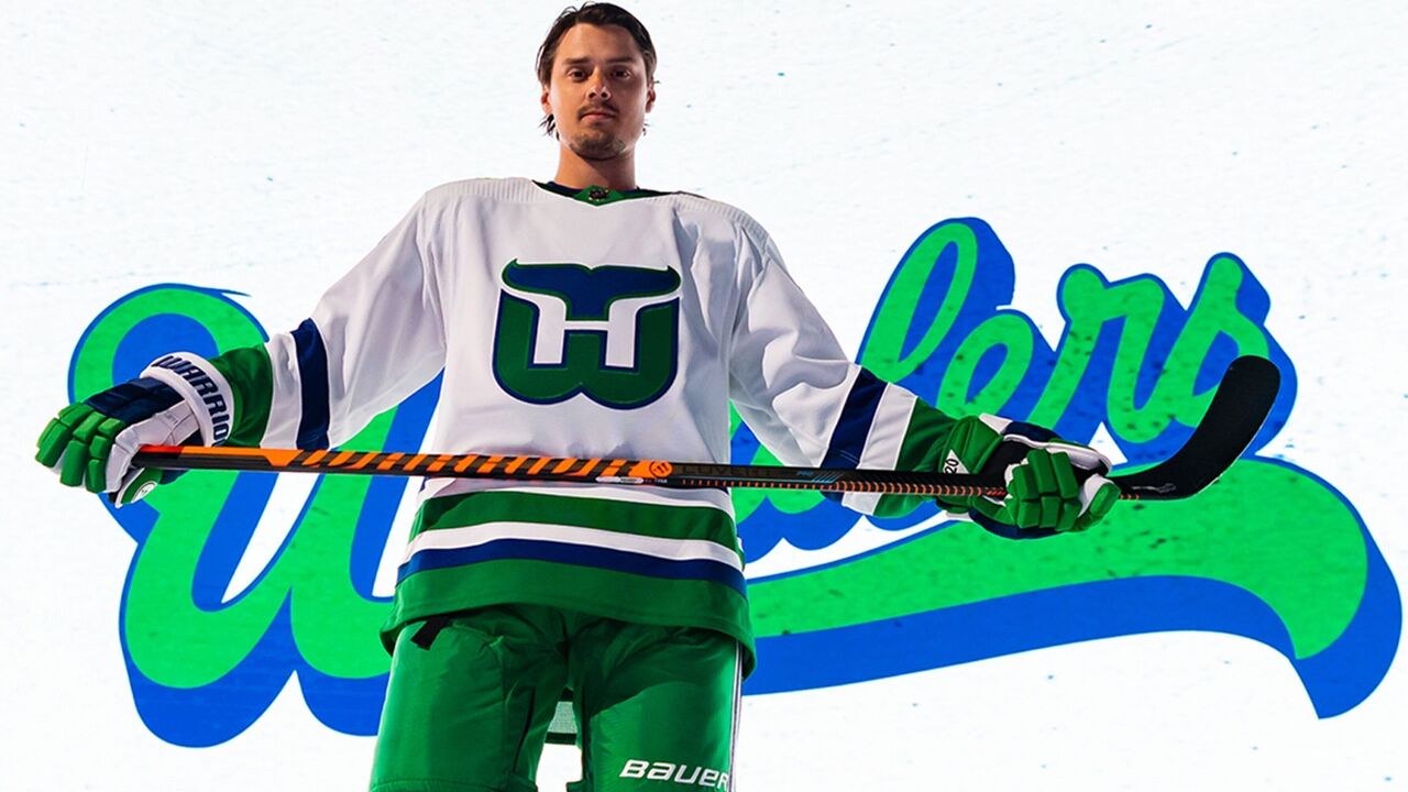
Both experts salivated over this last look, which is an ultimate throwback.
The Hurricanes have never worn the Whalers' classic white jersey and will slip them on only once this season: Feb. 10 as part of their annual Whalers Night. (The franchise relocated from Connecticut to North Carolina in 1997.)
What gets Frederick and Radom so amped: the Whalers logo is as beautiful as ever. The "H" formed from negative space between the whale's tail and the "W" is one of those golden design nuggets that decades later still delights.
"It's great that 'Hurricanes' has an 'H' like 'Hartford.' It works," Frederick said of a happy coincidence. "Through the years, this logo has always come up in the top 10 best sports logos of all time. It's clever but not overly clever. It's a very appealing graphic. It's simple. It's awesome. I love everything about it."
"If anything gets a 10 out of 10," Radom added, "it's this and the Canadiens."
A bonus of Whalers Night: Hurricanes players will wear waist-to-ankle hockey pants (also known as Cooperalls) during pregame warmup.
"Shoot it into my veins, baby," Radom said of the early-80s fad. "I love it."
Frederick's rating: 9/10
Radom's rating: 10/10
John Matisz is theScore's senior NHL writer. Follow John on Twitter (@MatiszJohn) or contact him via email (john.matisz@thescore.com).
Copyright © 2023 Score Media Ventures Inc. All rights reserved. Certain content reproduced under license.